I know that the “thing” now with houses is to have a lot of architecture design type stuff and lots of fancy wood and things. I’m just not into that. I cannot stand wasted space. Every piece of furniture we own we try to purchase with storage capabilities in mind. We approached our home the same way. We wanted to utilize every square inch! With that in mind, we have no foyer area. I never understood why people would have a little section devoted to their front door? Right when you walk in our front door our house beings 🙂
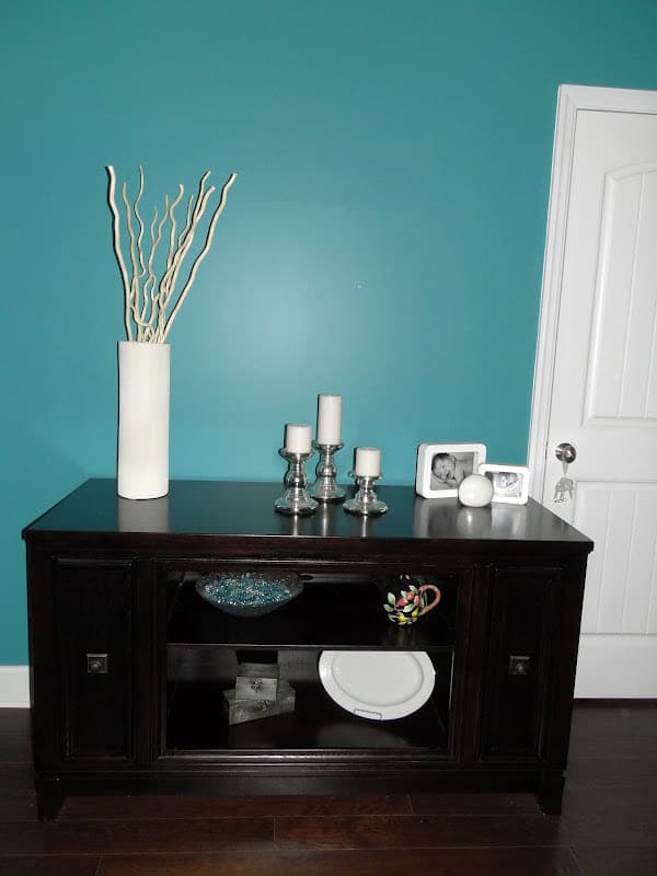
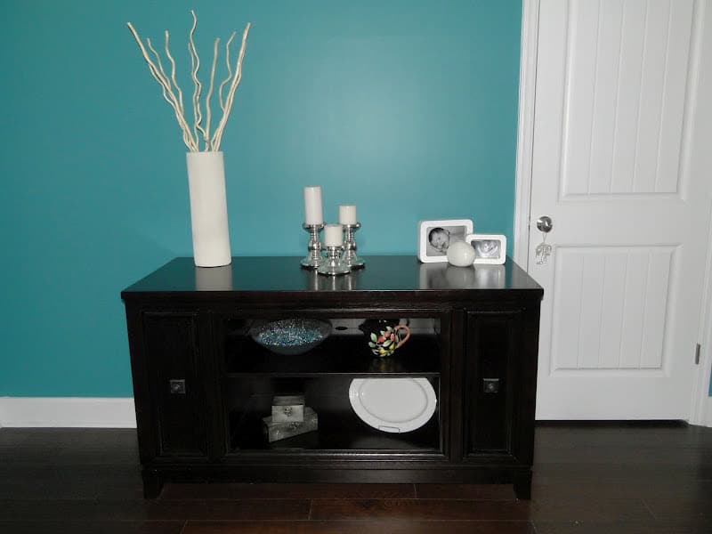
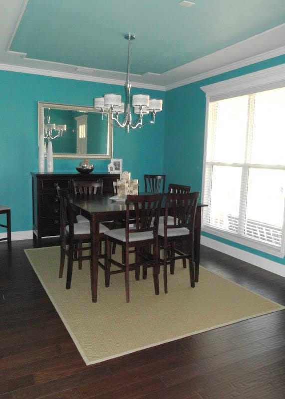
I’m hoping you can tell just by seeing our “design” but our goal was for a modern/beachy feel to everything. I would describe my design style as simple…and the reason it’s simple is because I don’t like decorating haha. I seriously just wanted to buy a bunch of junk and be DONE with it. When you first walk in our “foyer” area is actually just a portion of our dining room with a table against the wall. I call it the “front foyer table.” It’s actually a tv entertainment center that we just took the glass doors off of. It’s a great height for parties and I like the storage pull out drawers on each end (we store dvds and movies there). This piece and our buffet piece combined are the most expensive pieces of furniture we own and I’m so glad we bought them. We’ve had them for 4 years now and they have like zero scratches. All the cheaper stuff? TOTALLY scratched up and need to be refinished. It pays to buy good quality I guess!
I have had every intention of putting some kind of art work above the table but who knows if I’ll ever bother. Maybe one of those free canvas pictures? But I won’t do it until we have a COMPLETE family photo which won’t be for like 10 years or so haha. Majority of the stuff we have in our house is from Ikea. The vase and candles are all from there. The white platter was Grammie’s (my dad’s mom) and the teapot above it was Nana’s.
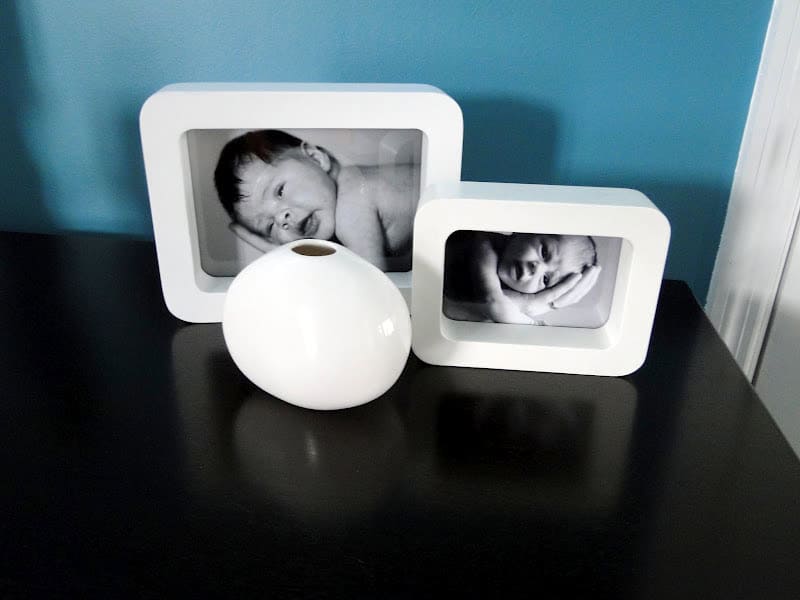
I LOVE these newborn shots of each baby in Zach’s hand…can you tell which is which?
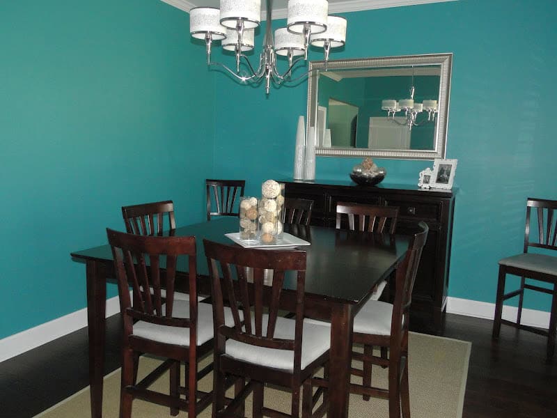
Our dining room table was purchased off the floor room at some furniture outlet in Atlanta. We got the whole thing (including 8 chairs) for under $300. It’s beyond covered in dings and scratches and our next BIG purchase will be a new dining room table. We use it more often than you’d think because we entertain so often. I REALLY want to find something that pulls out to seat 14 people. So far I have yet to find anything? We don’t have the space for a table that large but I’m hoping to find one where you can add a leaf to make it that big. I’m sure they are crazy expensive but it’d be nice to know a price to start saving for! Zach recovered the chairs in gray material (from Ikea) to match our color scheme. We had this set in the old house and it has lasted pretty well, it’s one of those tall tables with the bar stool height. The rug is also from Ikea as is the mirror 🙂
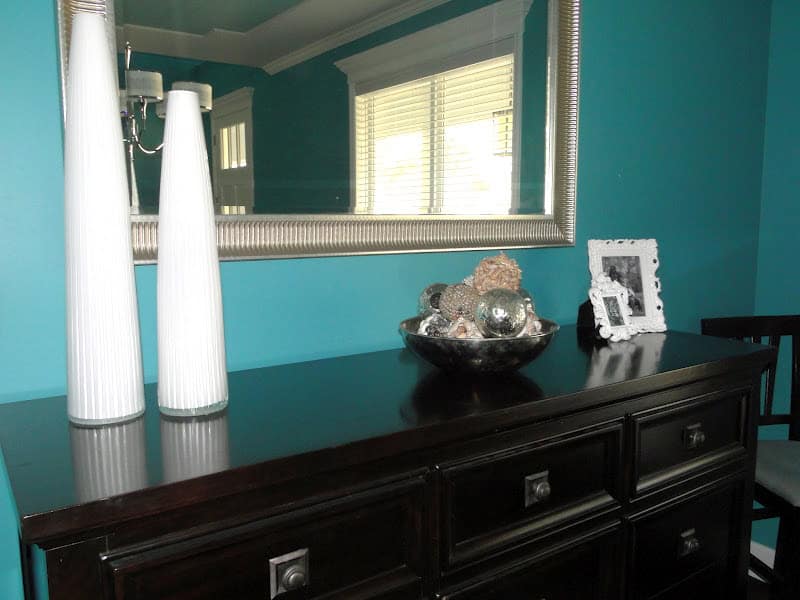
The vases were a wedding gift and the shell balls Zach (and I…but mostly Zach) made himself! You can buy craft balls from Hobby Lobby as well as the little shells and just hot glue them on. It’s annoying, but totally easy and WAY cheaper! This table is our buffet table but it’s actually a dresser. It stores all my china and such! It’s a little high for a buffet table but it looks fine with the tall dining room table and I like how it makes the birthday cake very noticeable for parties!
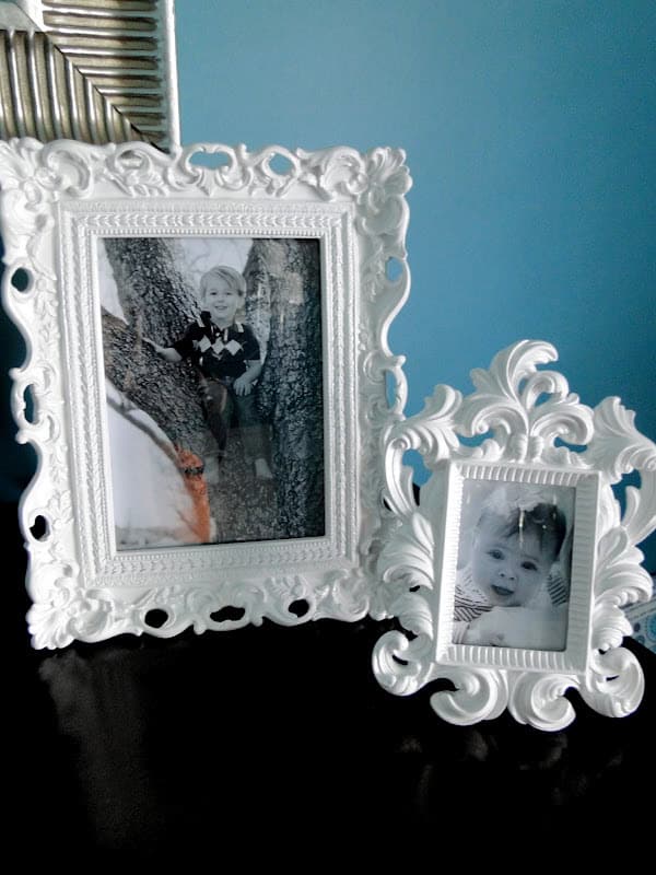
These are pictures of the kids! I change them out frequently
Frames are from Hobby Lobby, my favorite place to get frames and such from 🙂
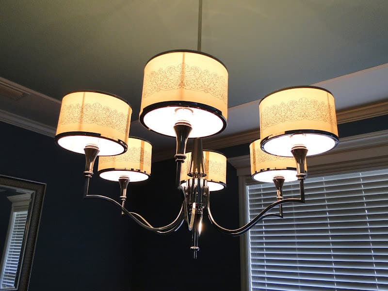
This is the best I could get of our lighting in the dining room, each piece has decoration on it, can you tell?
We really wanted super tall windows. Our front door is an over-sized door as well (for safety reasons I cannot STAND glass doors or doors with windows all around it. Our door just has three small windows at the very top and no one is tall enough to see in them!) We keep all the blinds shut all the time (Levi barks like crazy and we live on THE busiest corner so people are constantly driving and walking by). We did get legit hardwood floors but only in this area of the house (you can see more about our flooring choices here). We’re not big hard wood people. I just don’t think it’s as cozy, comfortable or inviting as carpet. I know that’s old school but Zach and I agree on it! To add a more “designer” type touch our lighting girl suggested we paint a section of the dining room ceiling a lighter shade (our living room is two toned in these colors as you’ll see below) and put thin trim around it. It looks awesome and is such an inexpensive way to add a little something different to a room! We would have had a tiered ceiling but couldn’t due to the room above so this was a great option!
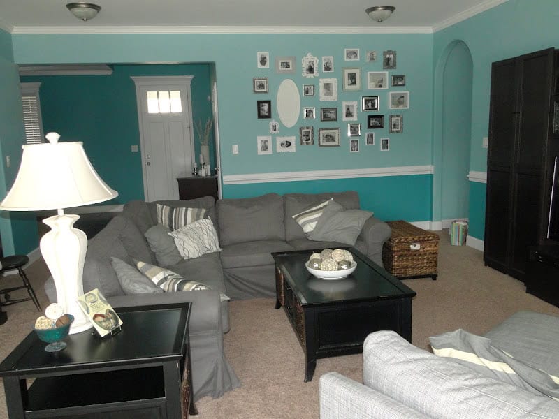
Our wall colors look super funky in pictures. Another reason to see it in person right!? You can read all about our paint color choices here (it’s actually a good post to refer back to when looking at other rooms too)! When picking a house plan, I really wanted something that had defined spaces yet was super open. There are no walls between our foyer/dining area and the living room. The corner of the living room and the corner of the dining room meet with archways leading to the kitchen (as you’ll see better in the next post). I love the openness of it and think the balcony above the living room even further adds to that open feel as do our windows 🙂 This is the view of the living room when you first walk in the front door.
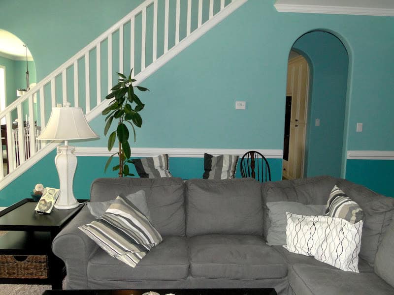
The right hand side of the room. You can see the archways leading to the kitchen. I really love our arches. Since our house is so basic we tried to do little, simple, inexpensive things when possible to add some special, interesting elements and I think the archways break up all the squareness of everything. The stairs are just straight up to the second story and the balcony is the same white railing across. I don’t even think I got a picture of the balcony? I’ll take one and add it to a future house post!
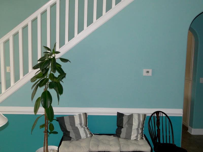
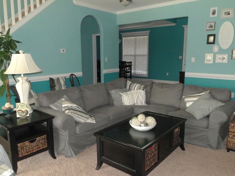
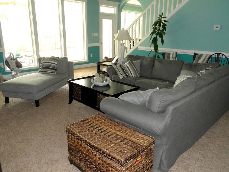
Our couch is from Ikea and I HIGHLY recommend it. It’s a sectional with a pull out bed and storage! In our old house it was tan but we wanted it to be gray for this house so we just bought a new cover for it! Isn’t that awesome?!?! Any the covers are washable. You can’t beat that! The pillows are all also Ikea. The lamp was Nana’s and the chair beside the bench (the bench has three storage baskets beneath it that keep Kye’s cars, trains and other random toys in them) is actually the only antique we own. It was a gift from Aunt Becky and Lonnie for our wedding 🙂 We have all the parts to make a HUGE wall clock on the wall leading up the stairs (not the wall with the tree against it, but the wall behind that) but we just haven’t gotten around to doing it yet.
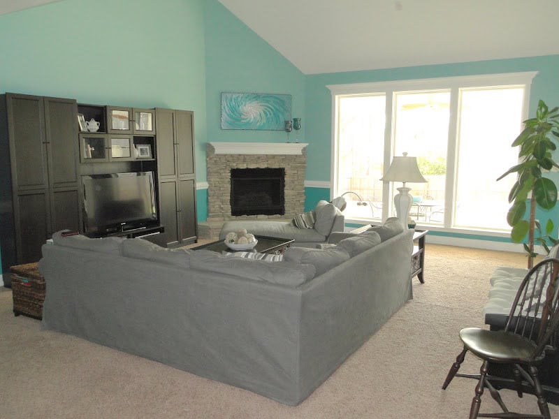
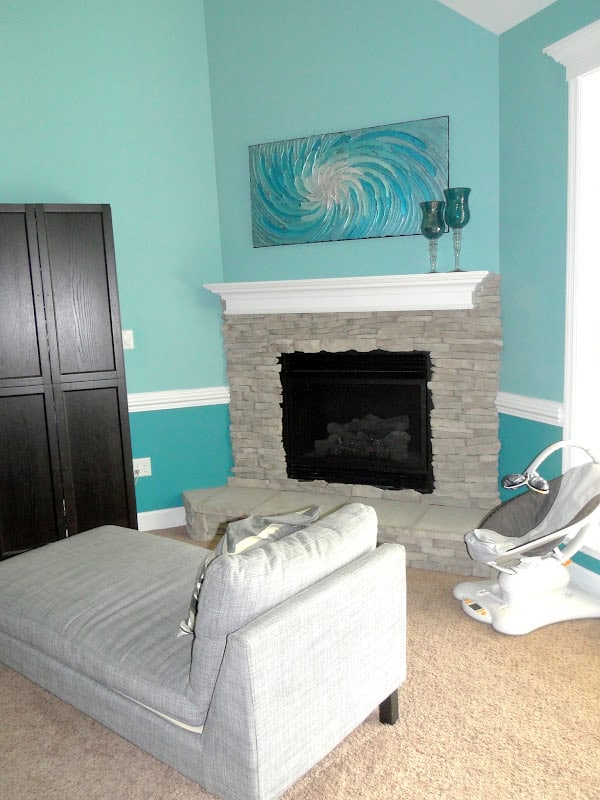
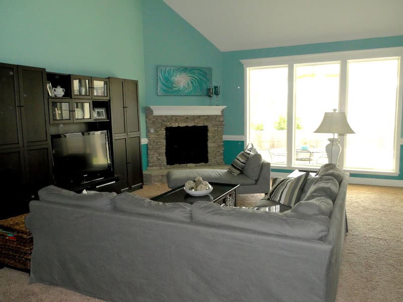
In the original house plans the fireplace was supposed to be in the center of the big wall of the living room. I have a pet-peeve about tvs above fireplaces. I know that it’s “the thing” now but I just feel like it looks like you worship your tv by having it that high! We moved the fireplace to the corner to free up space and I like the way it looks. We did gray stone around it and we insisted on having a hearth to sit on. With all the kids we want to have the extra seating will come in handy and I just envisioned us having Christmas card photos there (which we already have!!!). The painting I found on Etsy. It was under $150 and it was specially made for us to match our space. Is that not awesome? It’s a textured paint too and it just brings the entire room together. I love it!!! The chase lounge is also from Ikea. I push it against the windows for parties and three people can easily sit on it. We can comfortably fit over 20 people in this room when I drag chairs in but even without adding extra seating we have enough seats for 16, if you count the fireplace!
View of the living room coming from the door to the backyard
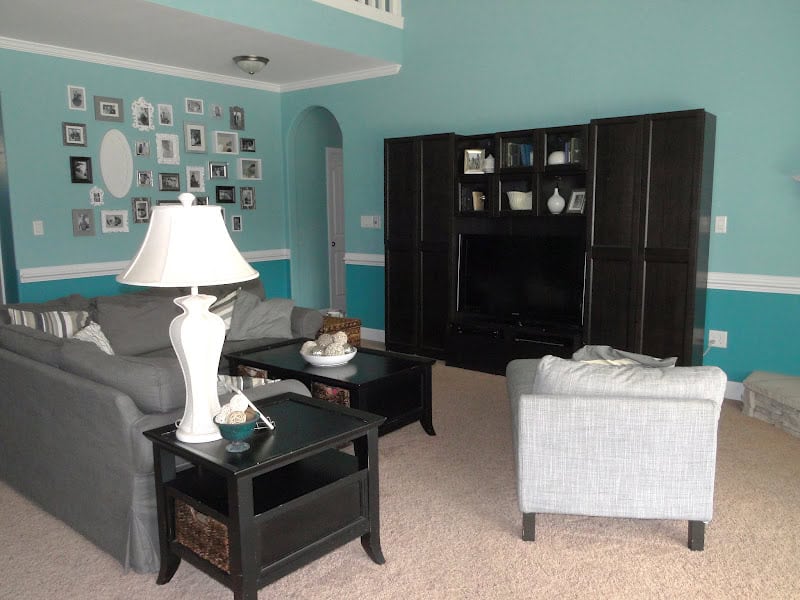
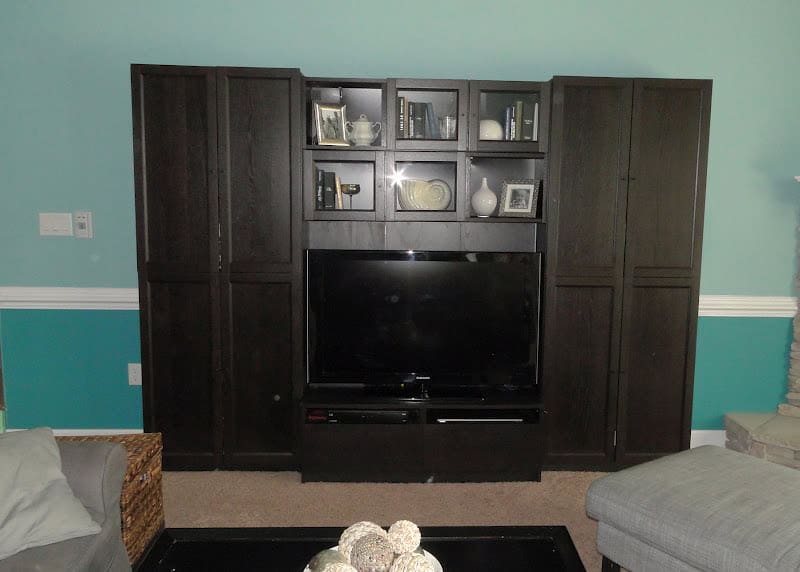
Our entertainment center is also from (you guessed it!) Ikea! It’s so awesome how you can combine pieces from their together. I don’t think it looks cheap…even though Zach had to pretty much ghetto rig the thing to make it stay up 😉 I like to use books for cheap decorations so that’s what is inside of it along with some white and silver pieces and a couple of picture frames (one shell vase was Nana’s, a little creamer thing that was Grammie’s, and we used one of the silver goblets we drank from at our wedding).
View of the space from the fireplace, you can get a feel for how it flows to the dining room. The coffee table, end table and bench all match. They were also dirt cheap and are scratched beyond belief. But you can’t really tell that much and I LOVE the storage in them so I don’t see us replacing them anytime soon! I’m hoping someday Zach will sand and refinish them as they are solid wood. He made more shell balls for the center of the coffee table as well. I know many of you are probably thinking with a toddler in the house I must put up all the breakables but you’re wrong. Everything you see in these photos always looks like this. The rooms may be messier (when Kye has out all of his toys for sure!) but I don’t believe in putting things up so they won’t get broken. We have taught Kye boundaries from an early age and he knows what he can and cannot touch. It’s never been an issue! The chest at the other end of the couch is from Target with leftover wedding money 🙂 It has all our board games in it!
You can see how tall our front door is here and what I mean about the windows in it. I like how they let in light, but no one can see in them or somehow break in! I REALLY wanted to feel safe in this house. It is on the larger side so I insisted on taking every precaution necessary to protect us from break-ins. We live on THE busiest corner so that makes me feel safer as there are always cars driving by and neighbors walking around or riding bikes and golf carts. We also got the top of the line security system and I’m mega anal about keeping everything locked!
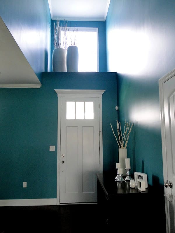
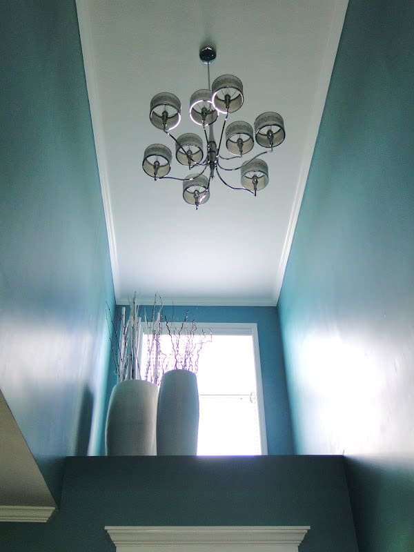
This is the view of the dormer window above the front door. From the outside of the house it’s the center window on the second story. It’s my least favorite space as I feel like it’s wasted. I wish we could have made it into some type of storage or something instead haha. When we first moved in Zach had all these ideas about putting a Christmas tree up there in December…um that junk is HIGH and is a PAIN to get up to so that won’t be happening. These vases were MEGA tough to find and I actually ended up going to Atlanta last summer and staying with Danielle and we scored an awesome deal on them at a TJMaxx Homegoods Store 🙂 It’s hard to tell with the lighting, but they are white and the sticks coming out are white, silver and that dark brown/black color. The light is a larger version of the dining room one!
The two lights aren’t the main lights for the space. There are two ceiling fans hanging WAY high up there…I’ll get pictures of them too 😉 It’s hard to think of all the things to take pictures of while I’m doing it! The ceiling fans are really good looking…but have caused us more issues! It’s a long, boring, annoying story but basically the lighting girl straight up didn’t know what she was doing when she picked our fans. You can read about our lighting choices here, btw! We are currently waiting for a fan to be replaced, and it will be the third one we’ve had in less than 18 months living here. Ridiculous!
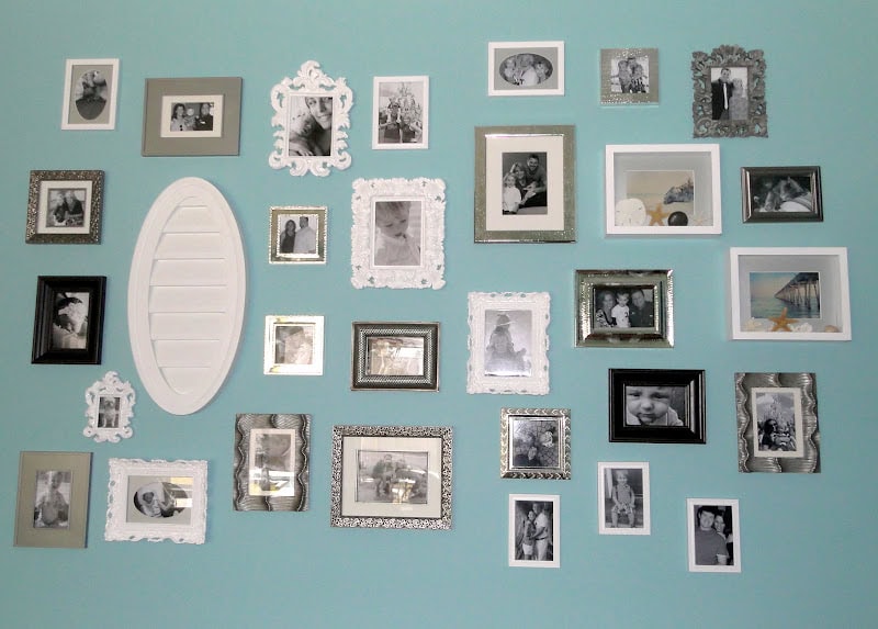
Don’t lie…some of you are SHOCKED to see this photo wall in our house!!! I know I talk about not having many pictures up, and it’s true. I don’t. I saw something somewhat similar to this in Pottery Barn and really liked it. I liked the idea of having all kinds of different picture frames and combining textures with it. We had the perfect wall to do it so why not? I found the frames at Hobby Lobby, TJMaxx, Ross, and Target. I made the shadow boxes using postcards I bought from Etsy and shells we used in our wedding centerpieces. The oval thing is actually used to cover up vents in houses, I got it from Habitat for Humanity for $3 and Zach just spray painted it. Each immediate family member from both sides of our families are represented on this wall, including our grandparents (well all of Zachs and only Nana from my side since she’s the only grandparent Zach ever met) and even our pets (at least for now…I imagine as we have more babies the pet pictures will be replaced haha). We did them all in black and white and the frames can easily be taken down to change them out and update them over time (Most of the frames are up with velcro. Since taking this picture we’ve already changed out some of the pictures. Most of them are still of Kye since we don’t have as many pictures to choose from of Britt but with time it’s starting to even out!). I chose the layout of the frames and had them all layed out in Britt’s room (prior to her being born) then Zach hung them all. It was a beast of a job but I really like how it turned out!
View of the room from the hallway leading to the bedrooms.
You can see the angled ceiling in this one! It’s where the roof peeks and how the 2nd story is “hidden” within it. Although we didn’t plan the slope for looks (obviously) I do think it adds a little variety to the room!
We spend MAJORITY of our time in the living room and kitchen area and I love them both! I feel rather confident that this room will continue to be comfortable even as our family continues to grow. We purposefully made all of the bedrooms smaller to give more space to the main living areas. We WANT everyone to be forced to gather together. Family time is so important and the last thing we want is our kids spending all their time locked away in their bedrooms 🙂 I’m so looking forward to making many, many memories in this special room of our home 🙂
- A Letter to my Son on His 16th Birthday From Mom (Kye’s Bday Letter) - March 20, 2025
- Open Letter to my Daughter on her 12th Birthday – Love, Mom {Britt’s 12th Bday Letter} - January 16, 2025
- Letter to My Son on his 6th Birthday – Love Mom - January 8, 2025







This is fun, getting to see your house better and really seeing how it all comes together from the little background snipets in your other photos. (And as always, your descriptions are great, not just one shot saying 'Here's our living room" haha)I say BOOOO to neighbors who have nothing better to do than complain about the color of your front door. The gray of course works great with your color scheme but really, come on people, leave The Parkers alone!And just as a side note, (and something you may have already done) even though you're going to have all of the photos up on the blog soon, burn a CD of all these photos and keep it in your safe deposit box or at someone else's house just in case anything terrible ever happened to the house it would come in very handy for proof during an insurance claim.
Looks just great. Love the color and the ceiling color. Don't know if you remember but I've always had a hall of fame in my house. The hallway is all family pics. Very nice job Emily.
Your house is beautiful! I love it! And that painting from etsy – love! Do you know what etsy store you used???
Your house is adorable! It makes me want to build a house like we want!! I am in the market for some new end tables and a coffee table and I love yours! I know you said you've had them a while but do you remember where you got them from or where there may be some that are similar?? I have all of Will's toys in the Living Room because he doesn't have a play room and his bedroom is upstairs. I am starting to not like all of the clutter and want something I can use as a hiding place for his toys!
I'd also like to know what etsy store you used!!! Love your picture wall 🙂
I love your picture wall! Fabulous!
I absolutely adore the color of your house and love how you mixed the two blues together! 🙂 So pretty! I became your newest follower. Erin
Love your wall colors! And that display wall is beautiful! Love all of the different frames!