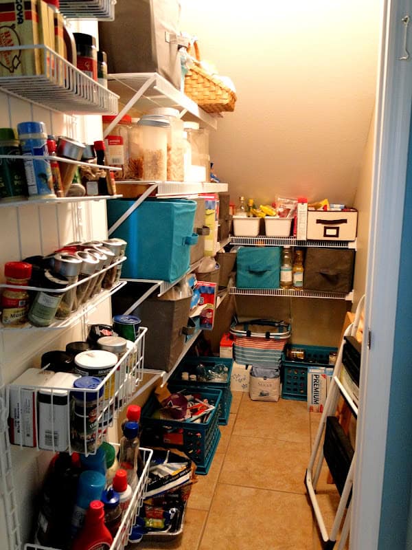
Other than the living room, the kitchen was the next most important area to me. I spent a lot of time in there and since our family will be (Lord willing) only getting larger, we knew we needed LOTS of storage space. To utilize all of our square footage we put a pantry under the stairs. When you are in the dining room facing the living room this is what you see.
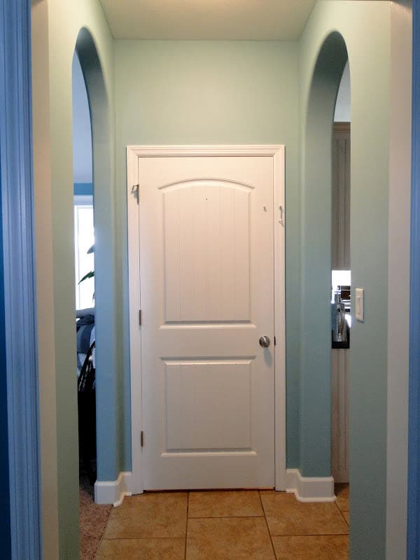
Our main pantry!
Making the choices for the kitchen we tough, but I LOVE what we ended up with. As I mentioned in our house building posts (but those were quite awhile back so you may not remember!) our goal was to keep our house payment as low as possible. We wanted to spend money in smart, long-term ways (we bought top of the line ac units, higher end insulation, insulated extra rooms, stuff like that…) and not on things that could be upgraded in the future. Our builder gave us a “spec house” budget. Meaning what he would spend on a house he was building to sell. We worked within that budget on pretty much everything. We would go to the places to pick stuff out and tell them we only wanted to see choices that were within our budget then we tried to pick out things that were unique, high-end looking options that fit our style but were within the budget we were given. You can read about our cabinet and counter choices here, our flooring here, appliances here, and lighting here.
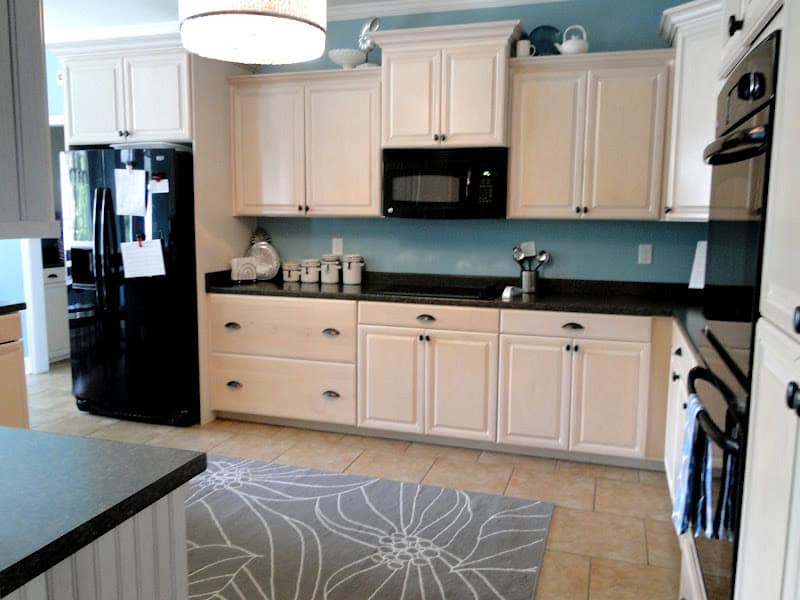
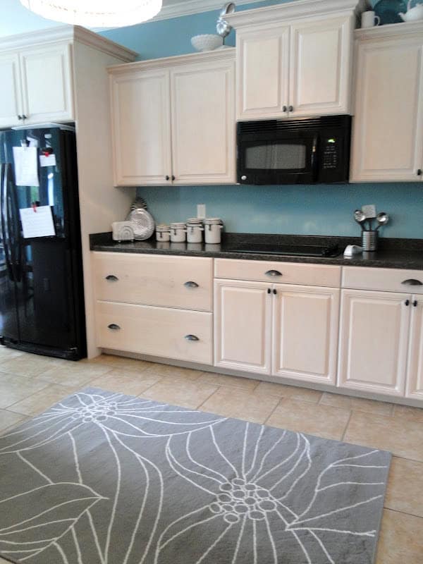
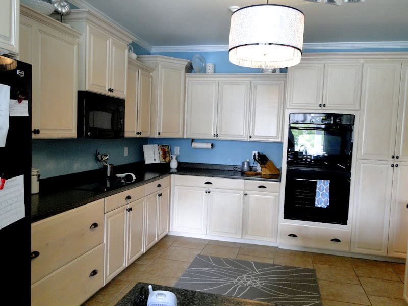
This is the view when you first enter the kitchen from the pantry area. I really was hoping to have cabinets that went all the way to the ceiling. I didn’t like the idea of having to decorate those areas! But with our ceiling height we ended up doing a staggered look instead and I do like how it turned out. The rug took me ages to find and we ended up getting this one from Ikea for only $40! It fits perfectly in the space and it was so cheap that we bought a couple of them so when the day comes that we spill red sauce all over it (which is totally going to happen) we don’t have to stress about it. 🙂 Our fridge usually doesn’t have anything on it but right now it has a list of all the frozen meals I made before Britt was born so we know what we have to eat for dinners (yes, she’s now 6 months old and we’re STILL eating off these meals! I cook now but mix these in too). I am NOT a fan of having things sitting out on the counter space. Everything in our kitchen has a place and we do our best to put it up after using each thing. Right now we do leave out her bottle warmer and a bottle drying rack but I put them in their spots before company visits 🙂
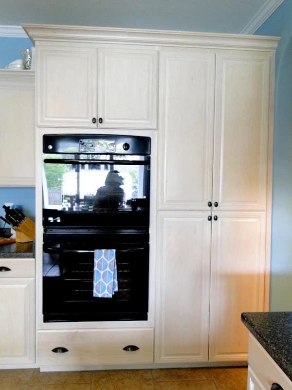
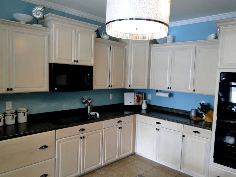
I am SO thankful we spent the extra money on the double oven. We haven’t used it too much yet but it’s super handy when hosting events and I KNOW we’ll get a ton of us out of it as we add more kids to the family. Beside it is our second pantry area. We have SO much cabinet space that there are several that are practically empty which is a good thing for the future 🙂 We also have enough space to someday add an island if we want!
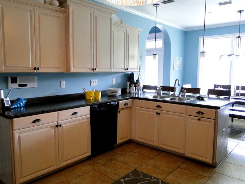
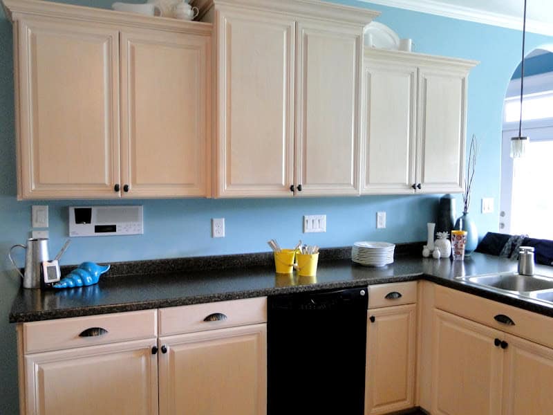
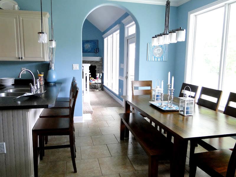
Ignore those yellow pails, we were having the family over so I stuck some silverware in them 🙂 Our trash can is the lower cabinet looking thing on the far right. Zach put in the garbage disposal himself. We do think we may eventually add a second dishwasher beside this one and there is plenty of space for it. That lower cabinet is larger on purpose to leave that space just in case 🙂 You can also see the intercom system to the left…honestly…kinda regret getting that as it’s never worked as well as we thought it would and we rarely use it. It may come in more handy as the kids get older though and it is nice to be able to hook up our ipods to have music throughout the house! I love that the sink is facing the nook and backyard. It’s the perfect layout to me. Our bar is even with the sink level as it’s easier to clean and to hand food to people that way. We use it quite often when we have company!
View from the sink of the kitchen
The big drawers (to the left) are my favorites. They hold ALL my pots and pans with room to spare!
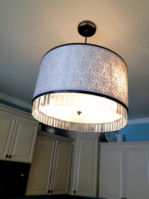
Basically, our lighting girl wasn’t too great at her job. She was sweet and the stuff she picked out is pretty…but not functional. She insisted that we needed a TON of lights in our bathroom yet thought this light would be enough for our kitchen. Our kitchen is WAY too dark in my opinion. Thank the Lord we did the windows without any blinds! We had the electrical ran for above cabinet lighting to add someday but we are going to have to install below cabinet lighting too. Now that I’m back to cooking I’m getting more headaches due to the lack of light. This light is super pretty though huh?
View of the kitchen/nook from the garage door.
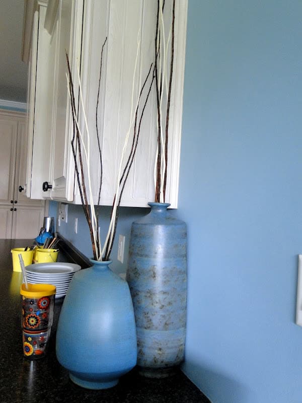
These vases are probably the most “valuable” decorations we own haha! They were wedding gifts and were like $40 each which is crazy expensive to me! I took this picture though to show you the beatboard look of the cabinet behind it. We have that texture of wood where the cabinets end throughout the kitchen and it adds to that beach vibe (you can see it in the bottom left corner of the picture above as well.) It’s all along the bottom of the bar as well as the entire side of the refrigerator.
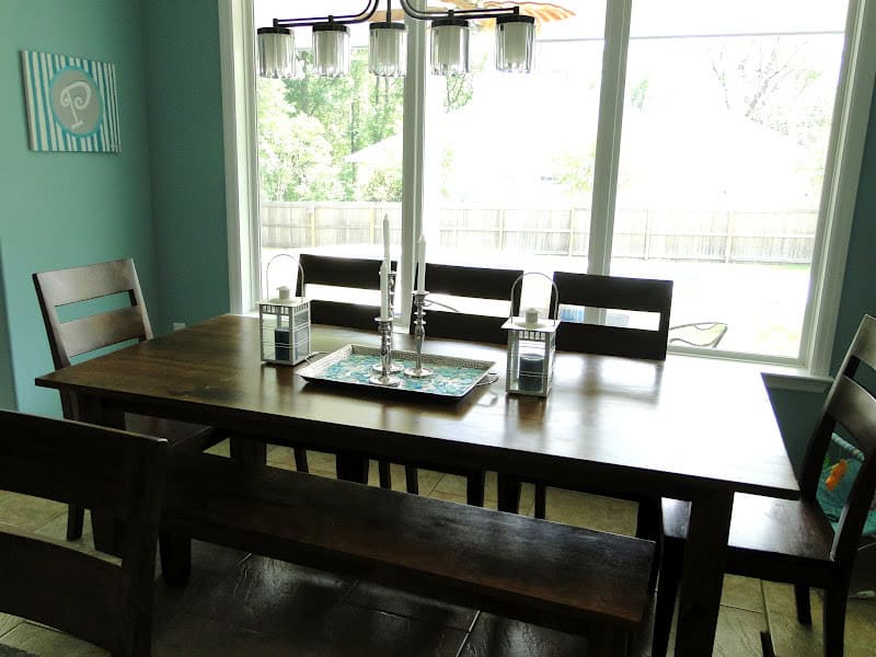
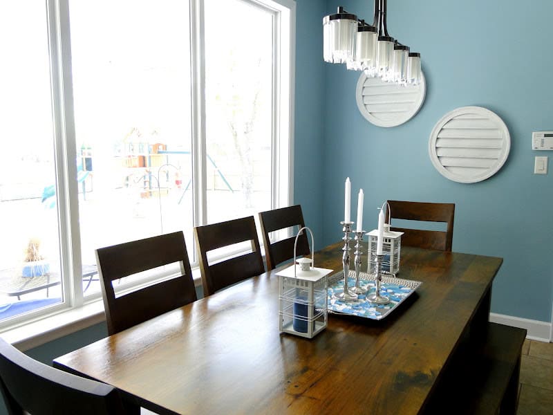
This is our breakfast nook. I do wish it was bigger. Our table seats 8 and the bar seats another 4 but it’s pretty cramped when 12 people eat in here (which happens more often than you’d think!). I’m also semi-disappointed in the table. It was a very expensive purchase to us and we really hunted for the right thing. I wanted something simple with a bench and something that would last us forever. Um. It will not be our forever table 🙁 For the price we paid (it’s from Crate and Barrel) it’s just not as good of quality I was expecting. It scratches easily which ANNOYS me. We will be keeping it for many, many years to come as I do like the look of it an it does fit everything I wanted in a table. I’m just annoyed by how easily it scratches!
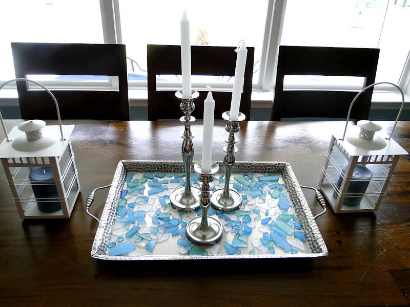
I wanted a centerpiece that would soften the table. All of that wood looked a little on the masculine side to me, ya know? I had no clue what to get so I just went into Pier 1 and had the ladies there pick everything out for me. Although the little glass stones are kind of a pain to clean, I do like the look of it all!
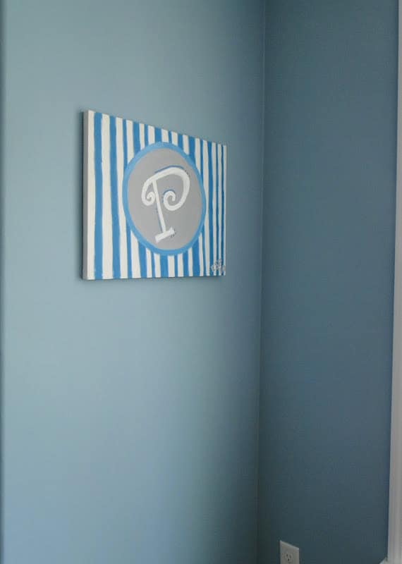
Painted by me at Danielle’s bachelorette night!
You can see the color of the wood grain better in this picture
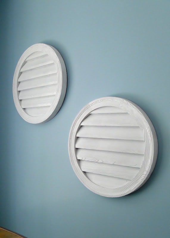
I was pretty pumped about this find! Zach and I were at Habitat for Humanity one day looking for stuff for the storage shed (shocker) and happened to find these! They are used on houses to cover up vents and such under the peaks of the roofs. They were only $5 each and I think they look mega beachy don’t you? I love them and love that I got an oval shaped one to tie into the living room!
Overall I’m very pleased with our kitchen and nook areas. I specifically picked the floors, counters, and cabinets with cleanliness in mind. I wanted patterns and materials that would be quick and easy to clean but would also look clean when they weren’t. And we for sure picked the right stuff! Our kitchen is a breeze to wipe up and I think all the color combinations flow well together as well as with the rest of the house. My favorite thing is sitting at the kitchen table as a family enjoying our meals together and watching the birds eat from the bird feeder. Zach and I often think of my Uncle Spear who loved bird watching and we’re thankful we can pass that past time along to our children 🙂
- A Letter to my Son on His 16th Birthday From Mom (Kye’s Bday Letter) - March 20, 2025
- Open Letter to my Daughter on her 12th Birthday – Love, Mom {Britt’s 12th Bday Letter} - January 16, 2025
- Letter to My Son on his 6th Birthday – Love Mom - January 8, 2025






I love your kitchen!!! Love the blue walls!
Great kitchen—and I really like that style table! The rug works perfect with that rug—and I love that pantry (that's the one thing I really really wish I had!!!!)
I love that table. BUMMER that it scratches so easily!And its beaDboard :-)And i'd switch your foryer light with your kitchen light. Get extra chain if you need it but I think it'd be the perfect switch!
Beautiful! When we bought our house the kitchen had just been re-done and the lighting was also horrible. Who wants to cook in the dark :)? So weird!
I just FELL in love with your kitchen! Love the colors, the layout, everything! (even cute light that doesn't work well lol) You are giving me some great ideas actually. I have a list of MUST HAVES when house searching this year. And I just added a walk in pantry. Right now I just have 6 shelves, and with 4 kiddo's I need a room for it! GREAT designing, house is awesome!
I'm stopping by for a visit from Kelly's Korner Show Us Your Life.You have a beautiful kitchen. I especially love the colors and details you're using.Have a terrific week.
I look at your pictures often because we are either buying a new house soon (awaiting their reply to our offer) or building a home next year. I absolutely love the color scheme. I'm dying to know what blue paints you used downstairs. Please share??It is such a open, airy, inviting space!
Really a beautiful kitchen! Just like a dream!
I’m completely in love with your entire home, especially the kitchen! It’s just like a dream!