Instead of doing individual posts about every little area of our house, I just combined them all into one long one so I can be done with this junk 🙂
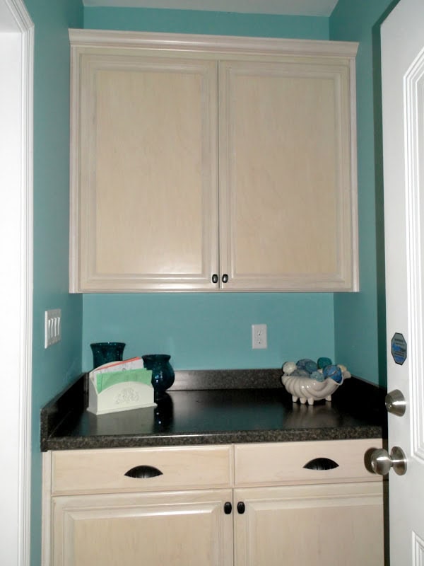
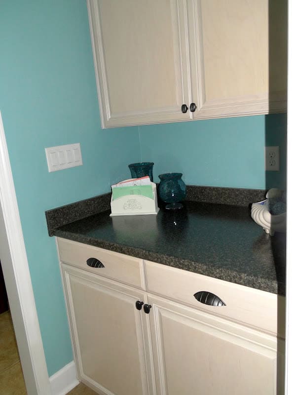
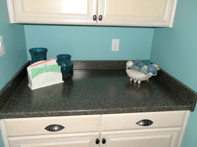
On our original house plan it had the garage door opening into the laundry room. I hate that. Our old house had that same design and it always bothered me. Who wants to walk through their laundry room every single time they walk into their house? No thanks! The garage has a storage room in it and that storage room is beside the laundry room so we decided to make that storage space smaller and push the laundry room down so we walk in from the garage into what we call the “drop zone.” It’s just a little space between the kitchen/nook and the laundry room. We had the cabinet guys made cabinets for the space for storage and I wanted a countertop to toss my purse on when I walk in the door. We also had them make the lower cabinets large enough to fit our dog crates. When we leave to go places we lock the dogs up in their crates in the lower cabinets! It keeps them out of sight and makes life much easier when we come and go.
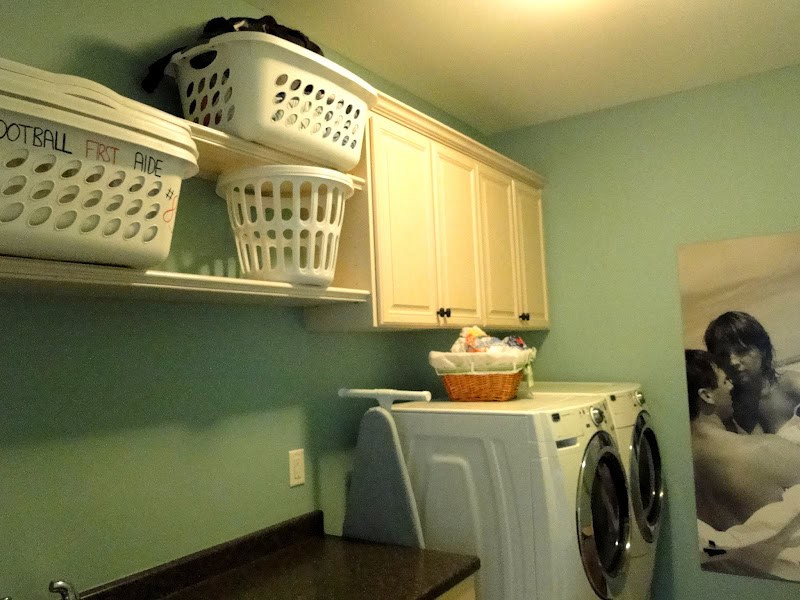
Our laundry room, like the rest of the house, is pretty basic. I wanted plenty of storage space but most importantly I wanted shelf space to store my laundry baskets. When I do laundry I have a “clean” basket for each person in the family and I sort the clean clothes into each person’s bin (Kye loves to help with this task!). I take each basket to that persons room to put the clothes away, makes the whole thing so much easier!
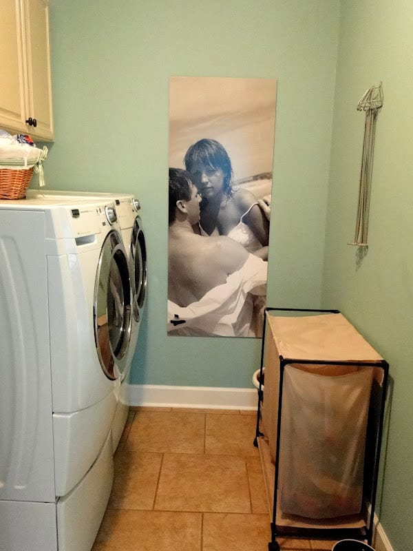
This picture is of Zach and I on the beach. It was taken during our engagement photo shoot with Javon (can you find Casey and Jordan on his website?!?!). I know it’s totally random but he used this poster for his booths at bridal shows and such and gave it to us when he was done with it. Where else could we hang it?!?! This little picture actually has quite a history and has caused a decent bit of drama in our lives. And now it hangs in our laundry room 😉
I love my hamper…it has three dividers (darks, lights and whites!) then I keep a basket on the other side of it for towels. The think on the wall is from Ikea and it’s used to dry stuff (suits, hang dry clothes, etc) it’s really awesome!
You can see the shelving space for my baskets! I also keep a basket on top of the washer for things that need to be stain treated
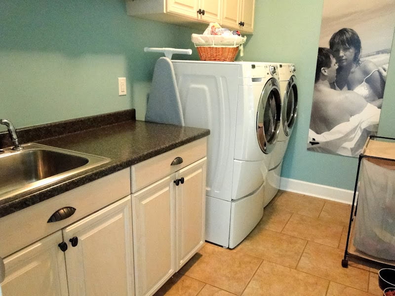
A mud sink was a must have for me for the laundry room. I rinse out stained items right away and it’s nice to just be able to leave them in the sink until I can wash them. It’s also handy to bathe the dogs, clean off shoes, etc. Originally they were going to put in one of those sinks you often see in people’s garages. They are plasticy looking? Super ugly! So I kinda fought for the stainless steel one, and I’m glad I did. I love having counter space and even more cabinet space as well!
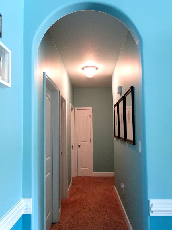
This is the view of the hallway from the living room leading to the downstairs bedrooms
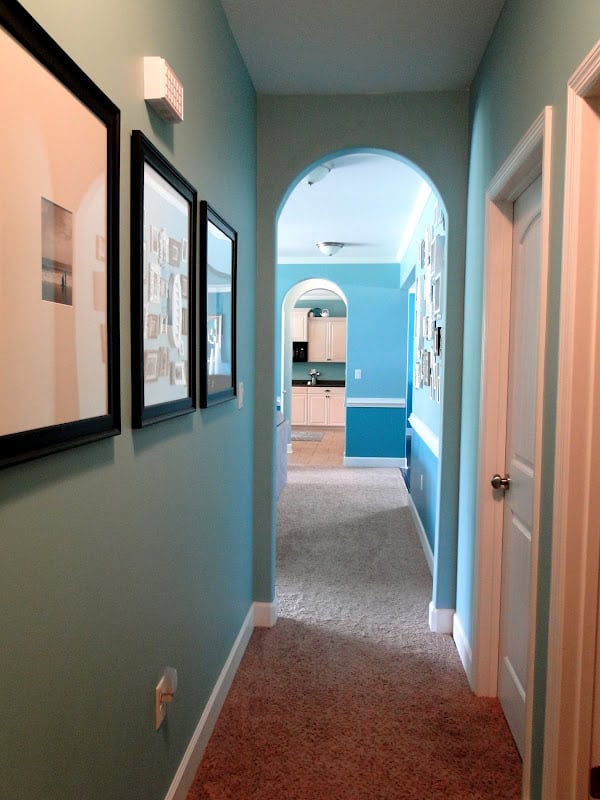
And the view from the bedrooms towards the living room/kitchen
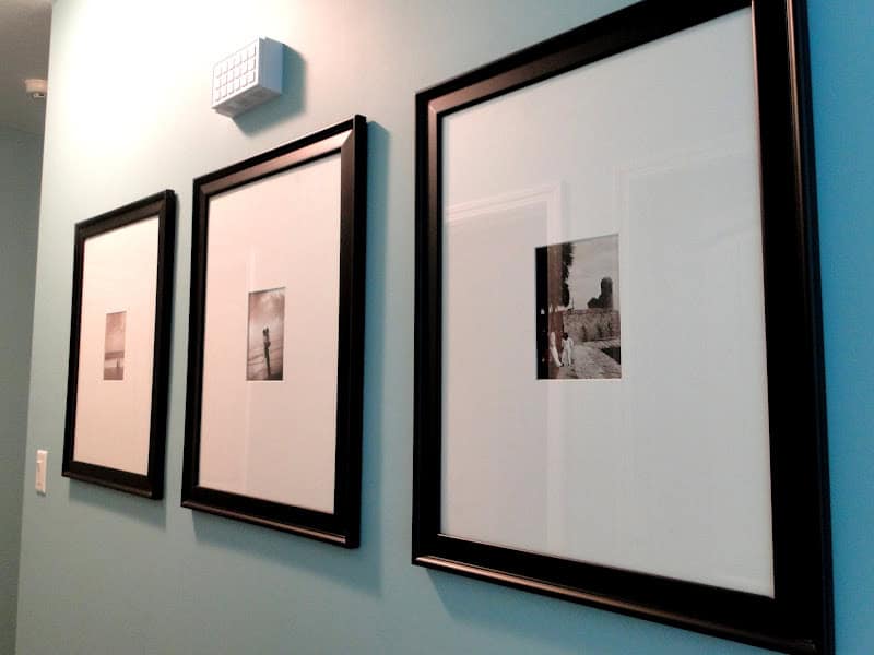
Also pictures from our engagement session with Javon! I had them matted with over-sized mats to look a little more artistic
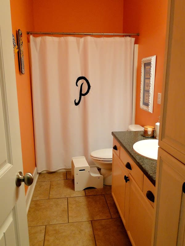
If we had the money we would have had two and a half baths downstairs. It would have been nice to have a little powder room for guests to use but it wasn’t worth the cost to us or the complications it would have created to designing our house plan. I personally like that guests use the “kids” bathroom as it forces me to keep it clean at all times! I don’t like junky kids stuff everywhere 🙂
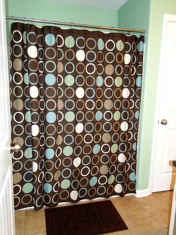
This shower curtain was a PAIN. It was tough to find someone locally who could monogram it!!! And the poor guy who did it totally messed up the first time and had to buy me a new shower curtain. I do love the end result though so it was worth it 🙂
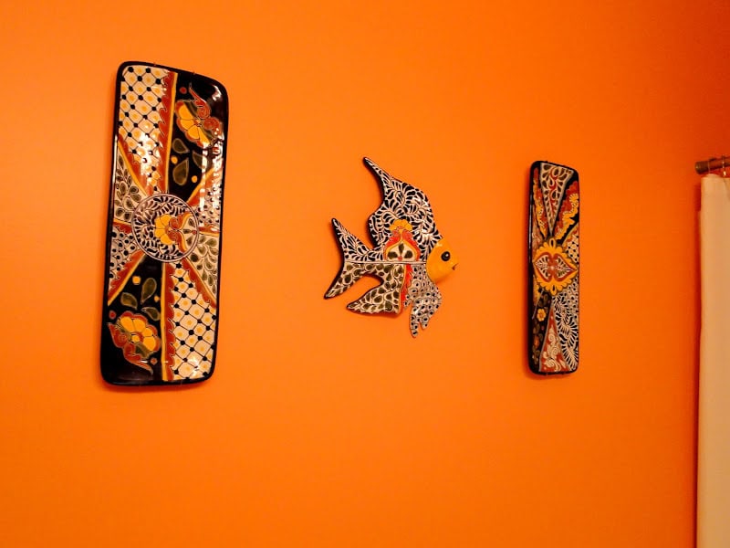
We found these in St Augustine last summer
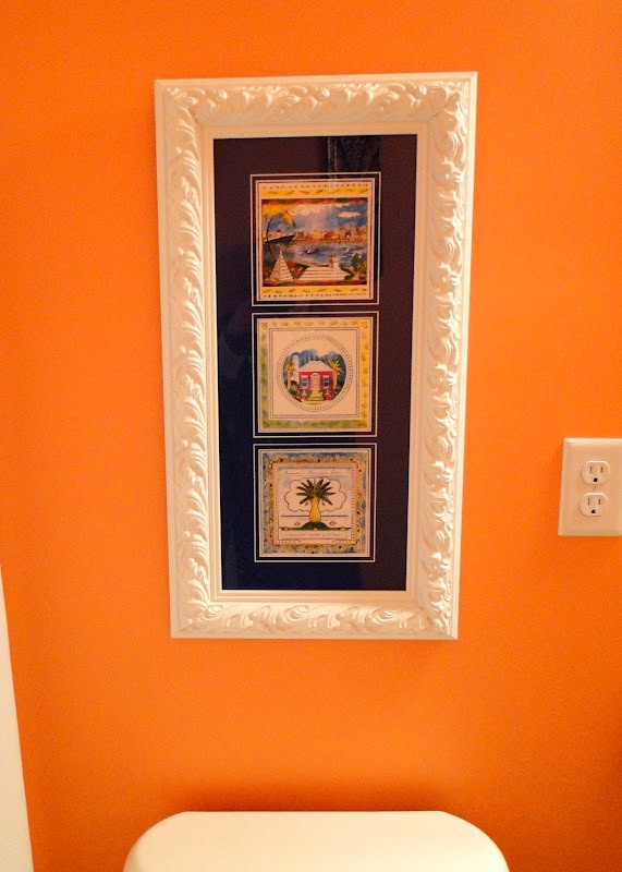
We got these in Bermuda and had them framed at Hobby Lobby, it is hung above the toilet
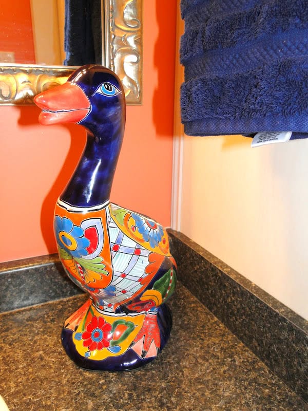
This duck is what the entire room is based off of, we got him from San Diego on an Aflac trip! It was the centerpiece on one of the tables 🙂
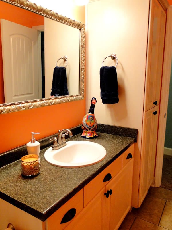
I LOVE all the storage space in this bathroom!
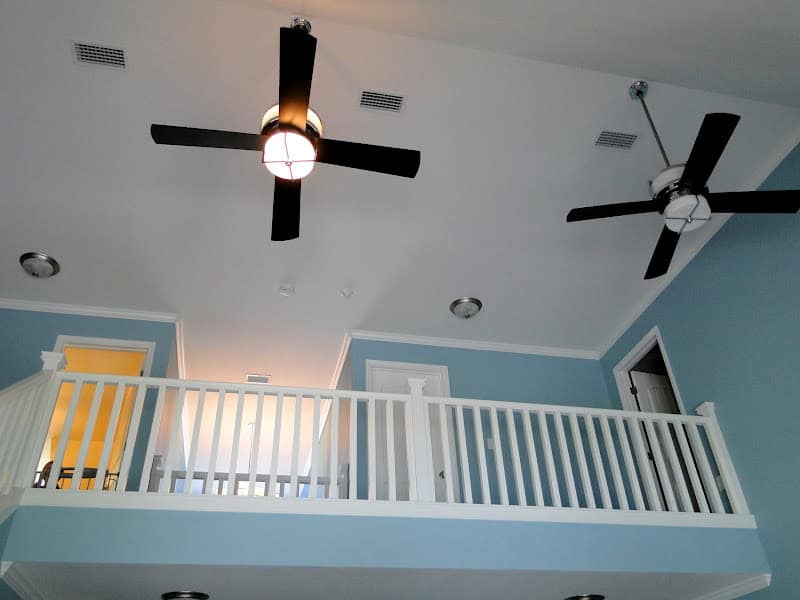
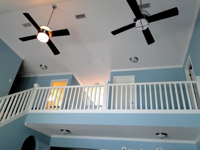
This is the view of our ceiling fans and the upstairs balcony from the living room. You can see the playroom on the left, guest bedroom on the right, and Zach’s office on the far right. I was pretty nervous about having a balcony…I like the way it looks but I could just see one of our kids falling from it! We had them put the bars closer together so I do feel safer about it…plus none of the young babies will ever have bedrooms up there so by the time they do sleep up there I’m assuming they will be old enough to handle it. You can tell only ONE of our fan lights work right now…don’t even get me started on how annoyed I am about that situation. HOPEFULLY someday we’ll have two working living room fans. We’ll see…
Another view
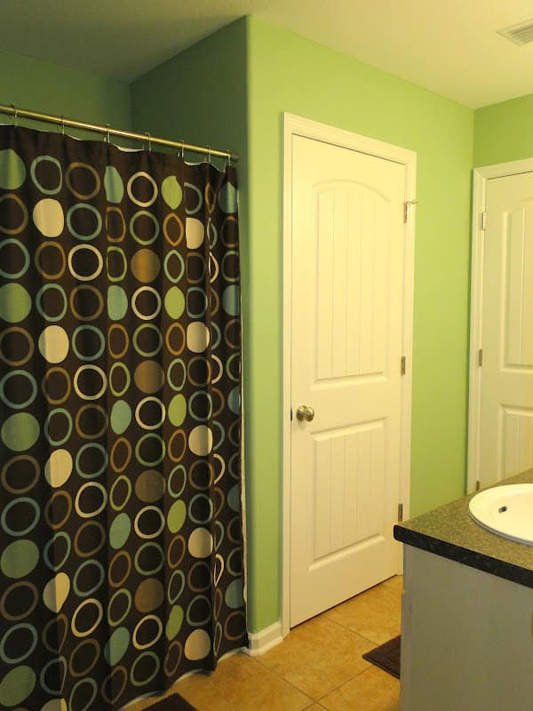
Upstairs, across from the playroom is the bathroom. I know a lot of people love the jack and jill styled bathrooms and several of the house plans we looked at had those. It actually wastes a lot of space and costs more because you have to have the space for the extra doors to open and shut and spend the money on those doors. I liked the layout of our upstairs as the kids rooms are pretty spread out and the bath they share is down the hall. We’ll have to get Britt a robe once she starts showering up there someday as she’ll have to sprint from the bathroom to her bedroom! We literally NEVER use this bathroom. Kye does occasionally when he’s playing upstairs and has to go potty. The toilet is actually a pain to keep clean because water just SITS in it so long it gets a ring!
Shower curtain from Target
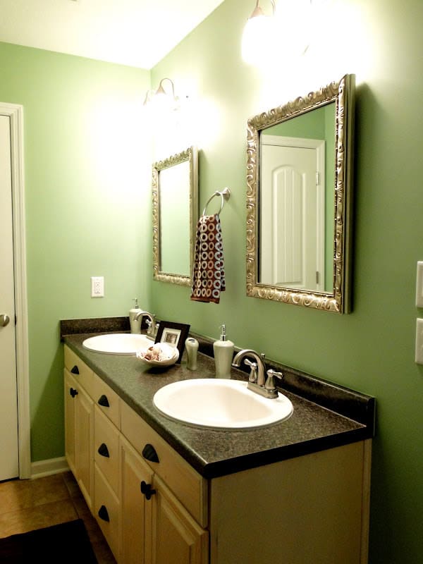
All the mirrors in our bathrooms are frames from Hobby Lobby with glass put in them!
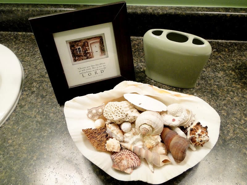
Shells from our wedding!
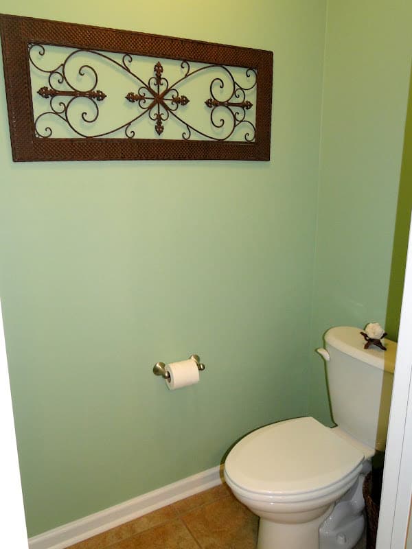
I wanted a water closet in this bathroom. We didn’t know what baby #2 would be and now that we know it was a girl I’m even more glad we did this! I want our kids to not have to fight over the bathroom so they each have their own sink to get ready and one can easily be using the bathroom while another one is in the shower 🙂 Decoration thing is from Hobby Lobby, the shell we got from the Bahamas and when we got home it still had the animal in it. SO gross!!!
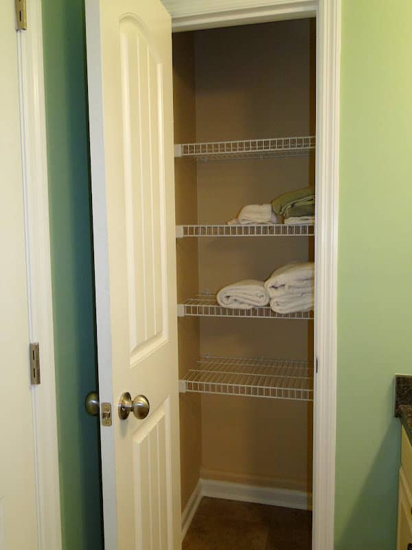
I do not have hardly ANYTHING in this bathroom. I want to leave the space empty for our kid’s stuff when it becomes their bathroom. I do have some towels for guests to use when they spend the night in the guest room.
There you have it! That’s the complete tour of our home!!! Many of you will be thankful that I’m moving on and going back to normal Emily type posts…I know I am ready to be done with this! But I hope you enjoyed seeing everything 🙂
- A Letter to my Son on His 16th Birthday From Mom (Kye’s Bday Letter) - March 20, 2025
- Open Letter to my Daughter on her 12th Birthday – Love, Mom {Britt’s 12th Bday Letter} - January 16, 2025
- Letter to My Son on his 6th Birthday – Love Mom - January 8, 2025





Your beach picture totally reminds me of my friend Stephanie's engagement pics too!! Total Abercrombie & Fitch!!!
I for one am NOT glad it's over. I absolutely loved the tour. Beautiful home!
I'm waiting on the post about the picture!!
Love all the color in your house!!
I love virtual tours of other peoples' homes, so thank you for doing this! Your home is beautiful . . . I am a fan of lots of color on the walls! Chris and I have always planned on having a large family (like 4 or 5 kids), Of course, infertility threw a HUGE wrench in our plans, but we hope and pray that we'll still have more. Anyway, so we've talked a lot about our forever home and what we would want it to be like, and it's pretty much A LOT like yours! We want large family living spaces, lots of bedrooms (even if that means they are on the smaller side), and overall functionality. I totally going to give him your home tour b/c I've been telling him how what you have is very similar to what we want.. Oh, and I'd love to hear the story behind the photo in the laundry room. . . who doesn't love a little controversy 🙂
I have been to your house but I loved hearing why you chose to decorate it the way you did and the ideas behind the pieces. Side note, when greg picked me up that night I asked him if he had trouble finding the house. He said no, and it was glaringly obvious he was at the right house by the wall color. He said it is like a blue beam of light as soon as he turned into the neighborhood like a bug to a bug zapper. hahaha
You cannot leave us hanging!!! What is the controversy about the engagement picture?!?!Its beautiful by the way! And I have thoroughly loved the house posts, I am always super interested in people's homes and how they decorate them! Your home is beautiful!!!