Now that Tess is 6 months old it’s probably about time to show off her room, right?
When we got pregnant with Kye we did a VERY gender neutral nursery (you can see it here and here). We didn’t find out the sex of the baby and wanted to decorate a room so we just aimed for something that would work for either a boy or a girl.
To be honest though, I think it’s more of a boyish room than a girlish one! When I got pregnant with Britt I wanted to wait to decorate the nursery until she was born (you can see her nursery here). I wanted to do a gender specific room!
However, I totally regret this decision. Having a new baby is not the time to be decorating a nursery! I spent a lot more money than I would have liked to because I was stuck ordering everything online and couldn’t go out to stores and bargain hunt. And I didn’t love her room the way I wanted to!
Third time is the charm 😉 When I was pregnant with Tess we, again, didn’t find out the sex but this time decided to do go a different route on the nursery. We did a gender neutral room but worked with a custom bedding designer (I cannot recommend Modified Tot enough…AMAZING to work with!!!) to design both boy bedding and girl bedding.
We had an ultrasound and sent the results to the designer (so she knew the sex of our baby but no one else did!) then she made the bedding for our baby and shipped it to us. We had a big box in the nursery closet with the bedding in it (zero percent tempted to look haha I know some of y’all are freaking out thinking you’d have to peek!) and once Tess was born Zach and the kids opened the box and put the finishing touches on the nursery.
It was AWESOME. It gave them something fun to do while Tess and I were in the hospital and allowed us to be surprised when we got home at how everything turned out. It was a WONDERFUL experience!!!
I had a really tough time coming up with a nursery theme that I LOVED. I decided early on I wanted to use a travel theme. It’s gender neutral and our family LOVES to travel 🙂 I also knew I wanted it to be modern and have a “cool” factor to it.
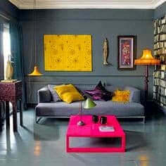
While browsing (and browsing and browsing) Pinterest I found this photo and was instantly inspired. I kept this photo on my phone and looked at it prior to making any purchase for the nursery. I loved the dark walls and the pops of color.
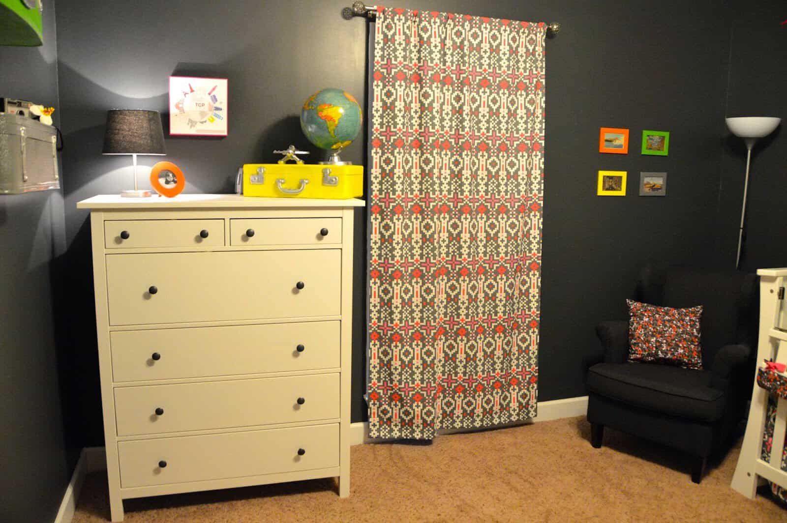
I knew her furniture was already white so I tried to make everything else in the room as dark as I could so the colors would really have that wow factor.
I truly could NOT be happier with how everything turned out! It’s my favorite nursery and quite possibly my favorite room that Zach and I have ever done. We were both so excited about it and both are so pleased with the end result!
I also really enjoyed the whole gender neutral room but gender specific bedding thing. It was fun to be able to fully plan the entire room while pregnant and then have that special element of surprise with the bedding when we got home from this hospital! I hope y’all like the room as much as we do!
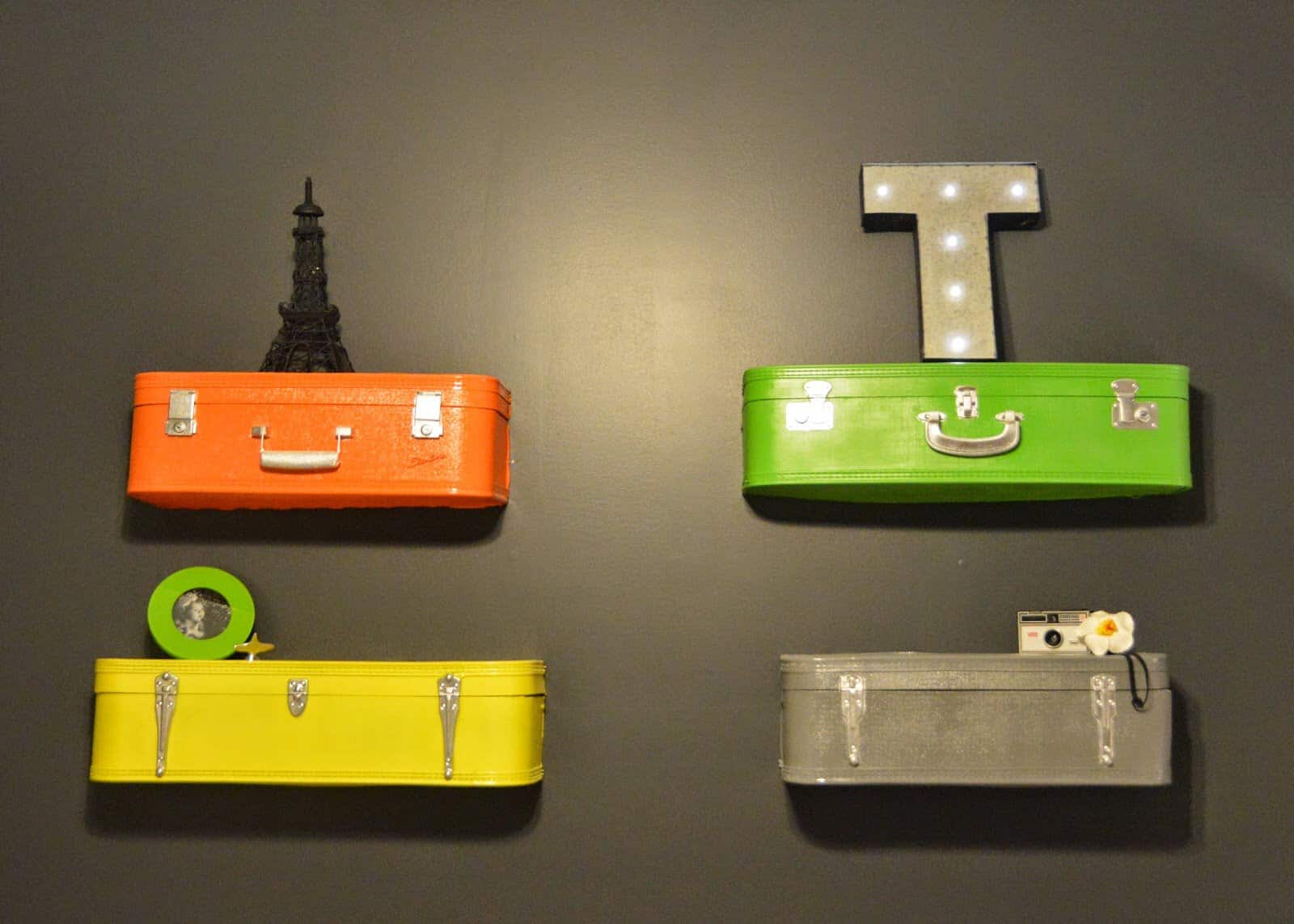
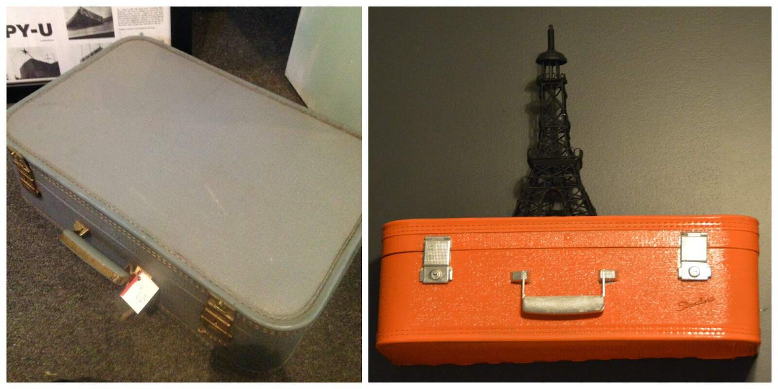
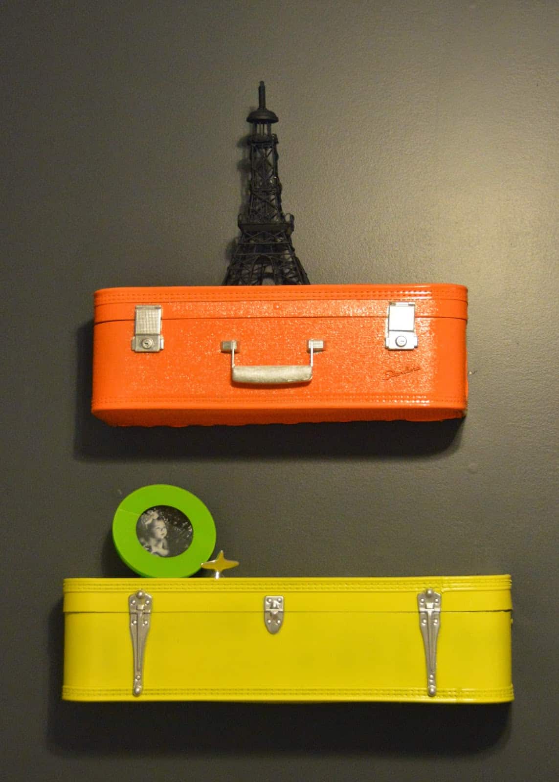
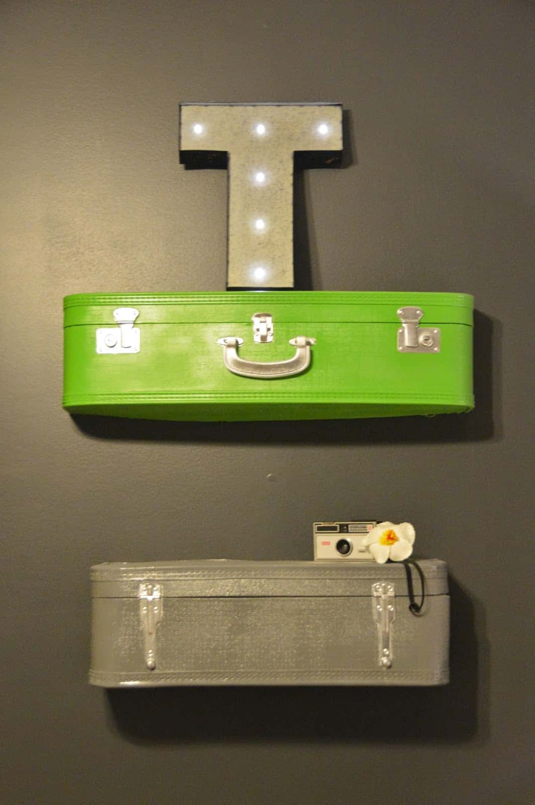
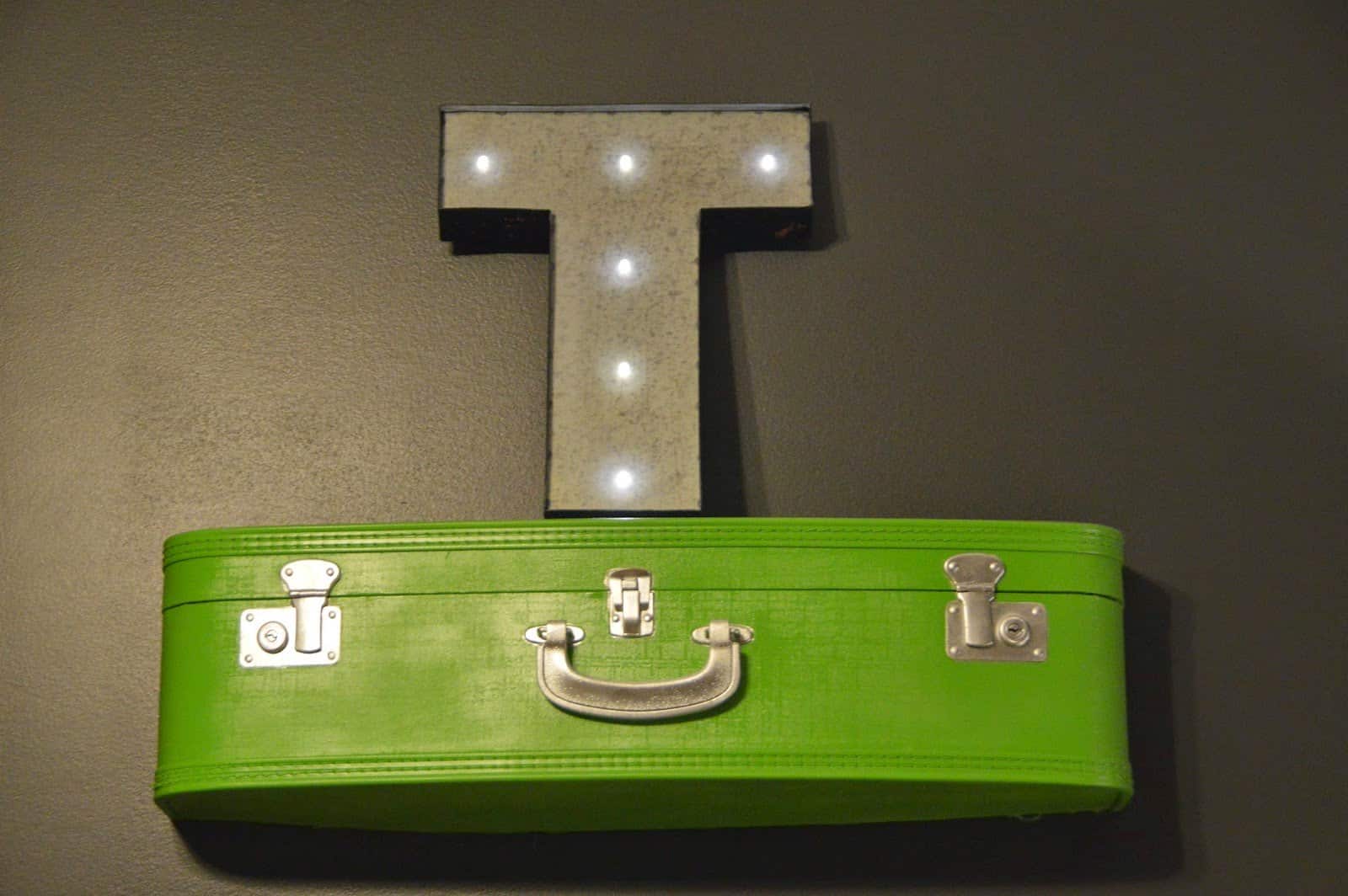
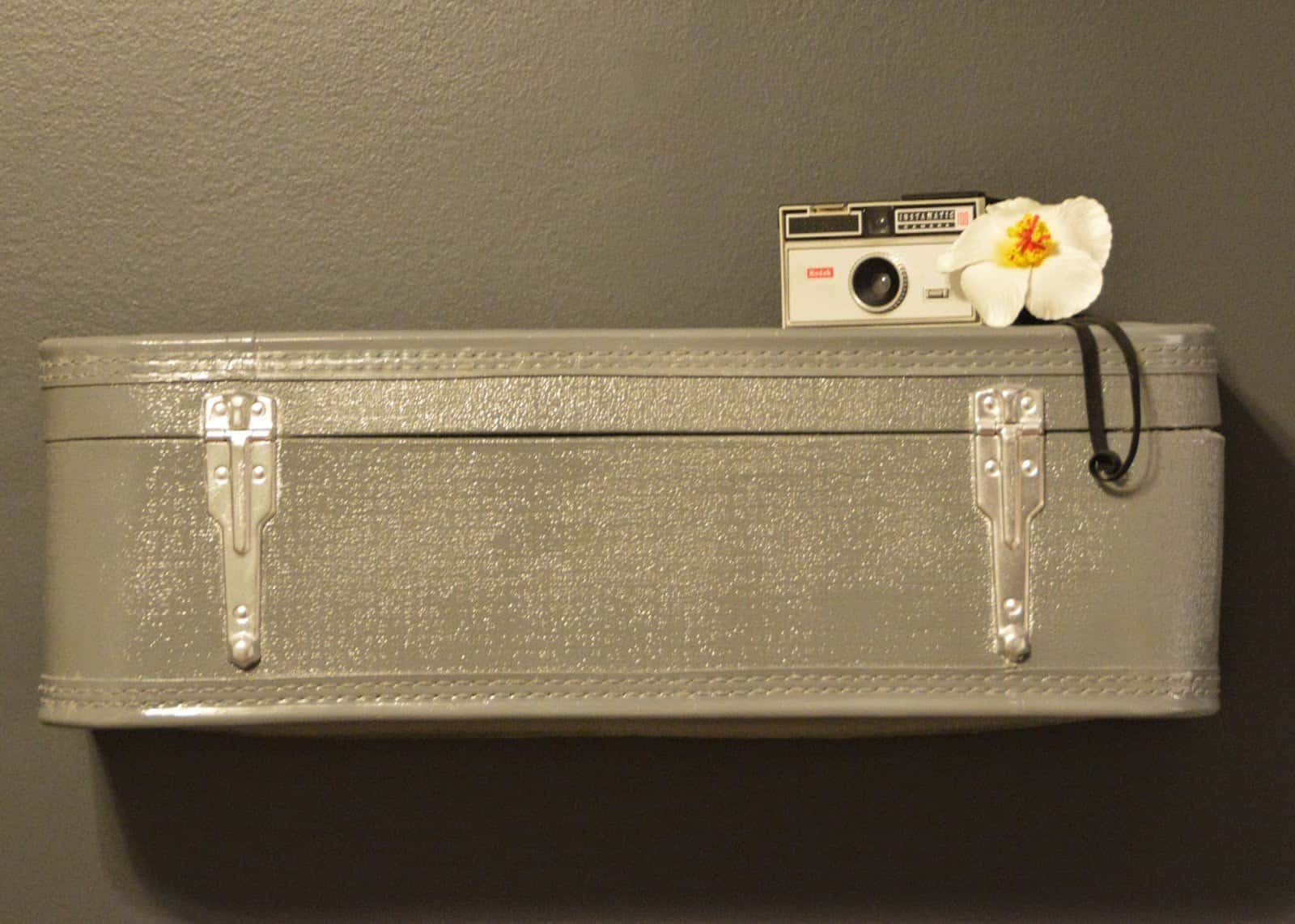
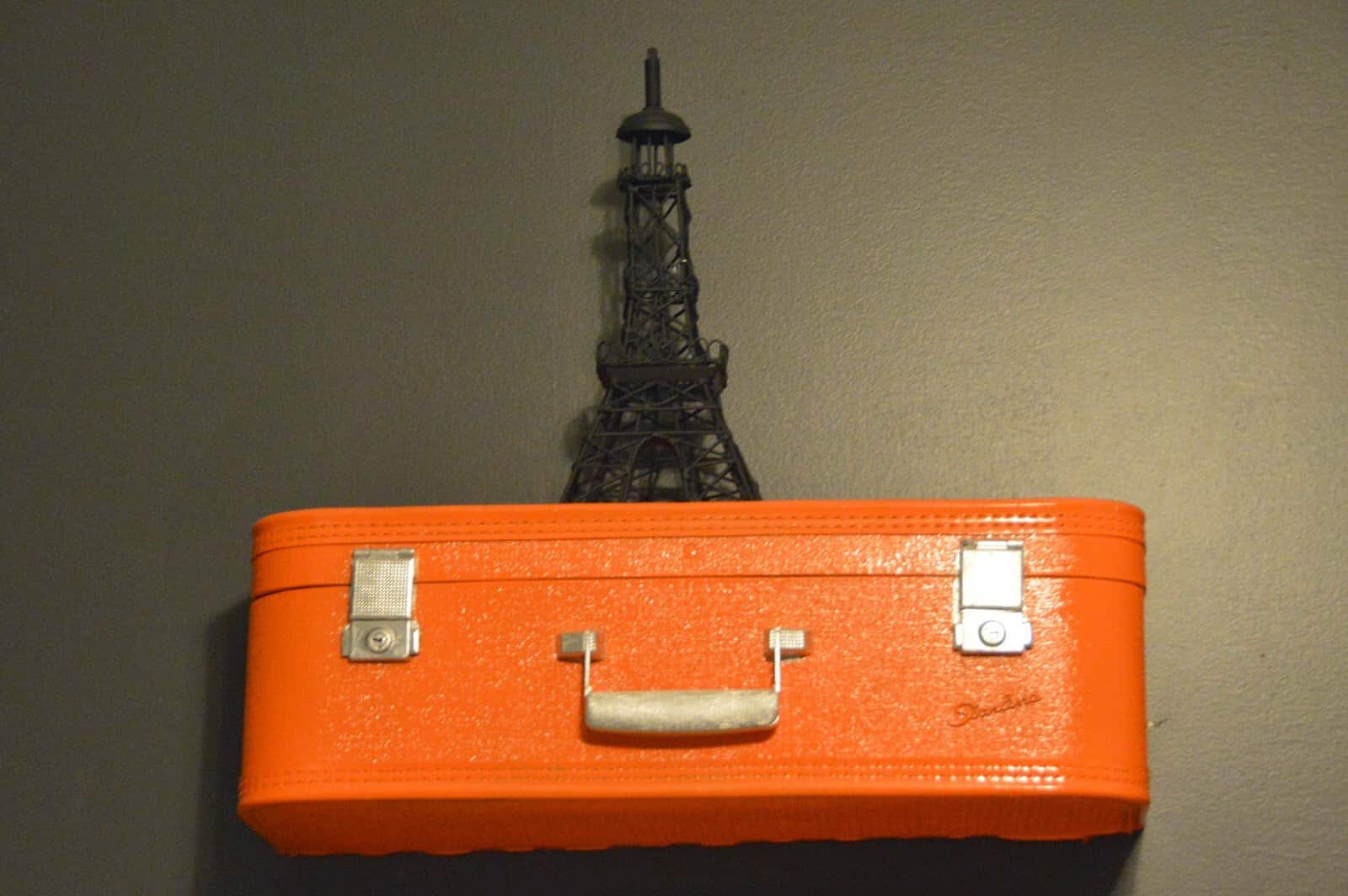
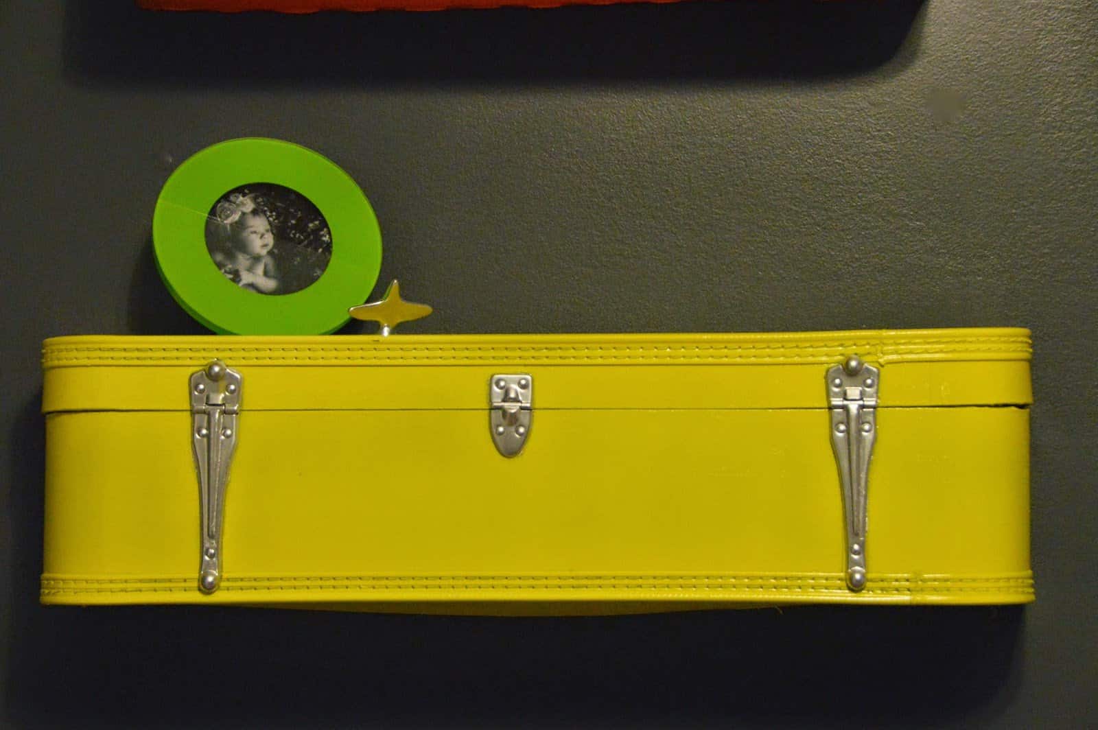
When you first come in the door these shelves are taking up the entire left wall of the room. I found two pieces of vintage luggage at a local store downtown (Chez What if you’re local…she’s AWESOME and SUPER affordable prices!).
Zach cut them in half (so 1 piece of luggage made 2 shelves) and painted them. They turned out better than I had even anticipated!
Before and After
The vintage camera is from Chez What as well as the frames. The flower is a hair clip we bought for Tess in Hawaii 🙂 The little airplane is from some artist my dad loves. He has a TON of figurines like this one.
I found this in his storage unit at his old house years ago and held onto it. I think it was from my brother’s room growing up? It works perfectly in this room!
I also picked up the “T” light and Eiffel Tower from Hobby Lobby. (We had another letter light as well in case Tess was a boy but Zach returned it for me while I was in the hospital so we didn’t risk anyone seeing it!).
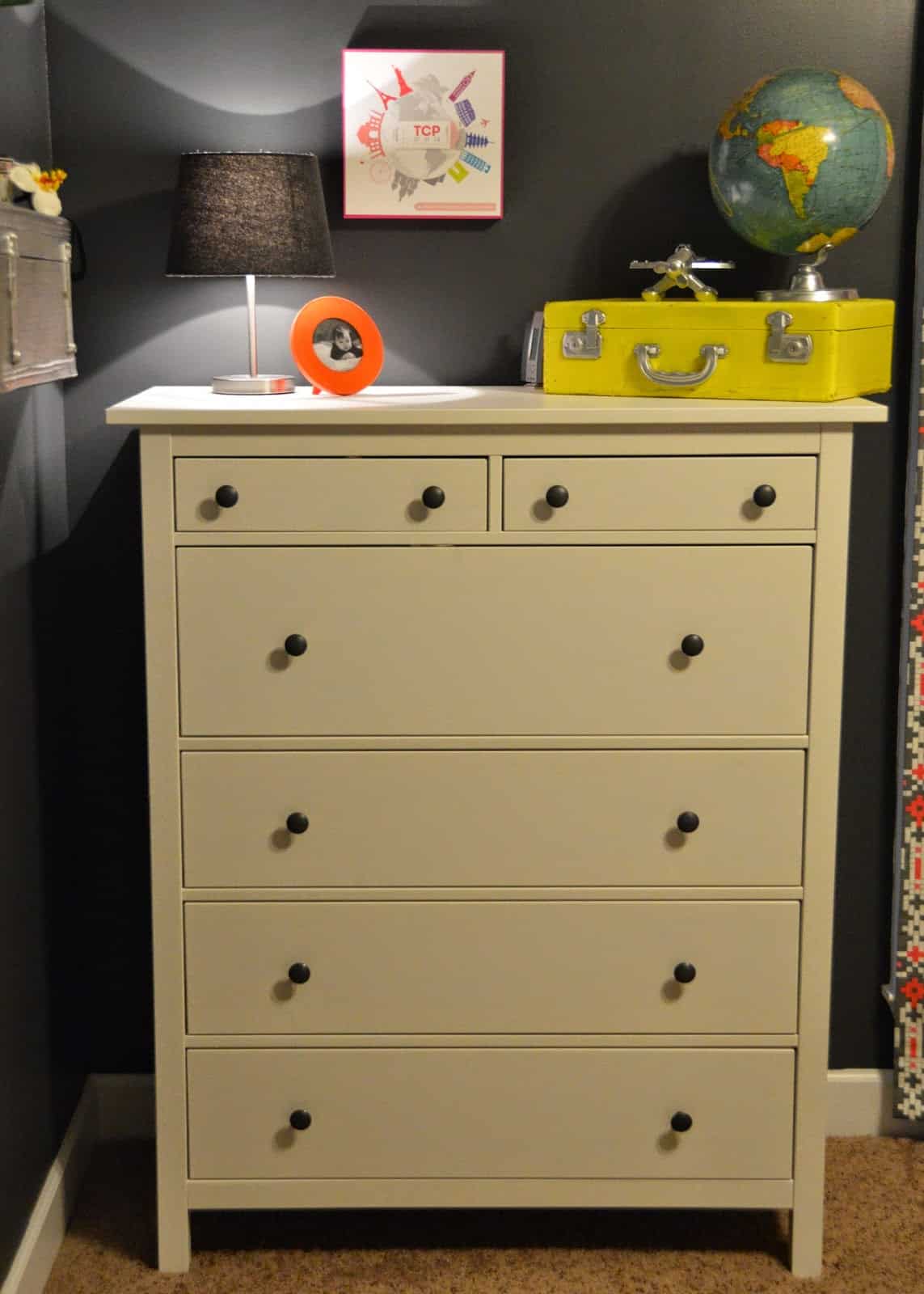
We used the same dresser sets for Kye and Britt but couldn’t stand the diaper changing table we had. We literally had three replacements sent to us due to a defective issue!
We got rid of them and bought new dressers from Ikea. We plan to use these, along with the crib (which is the same one since Kye) for the next baby as well!
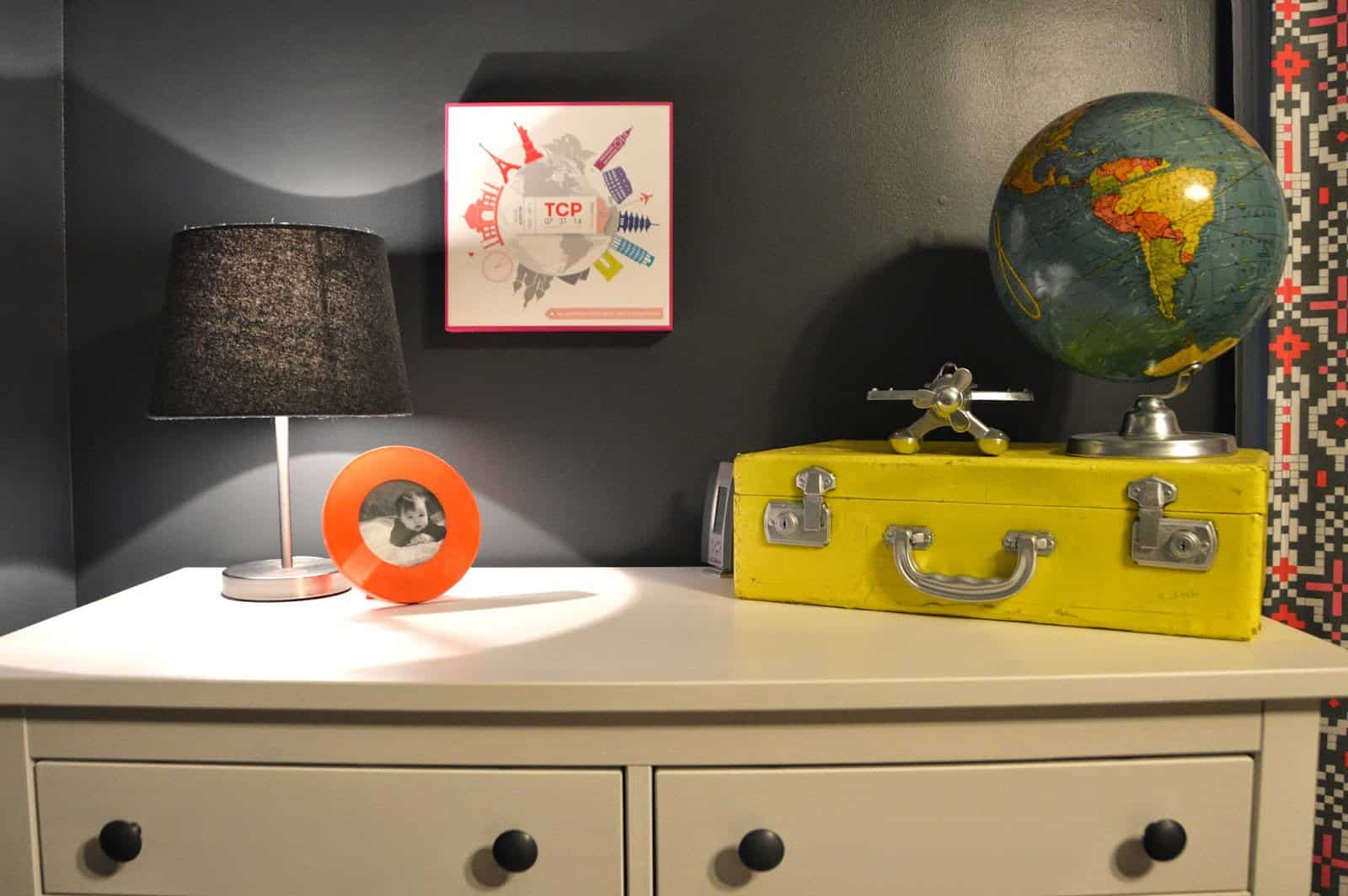
Another vintage painted suitcase! This one was in such bad shape that I got it for next to nothing!
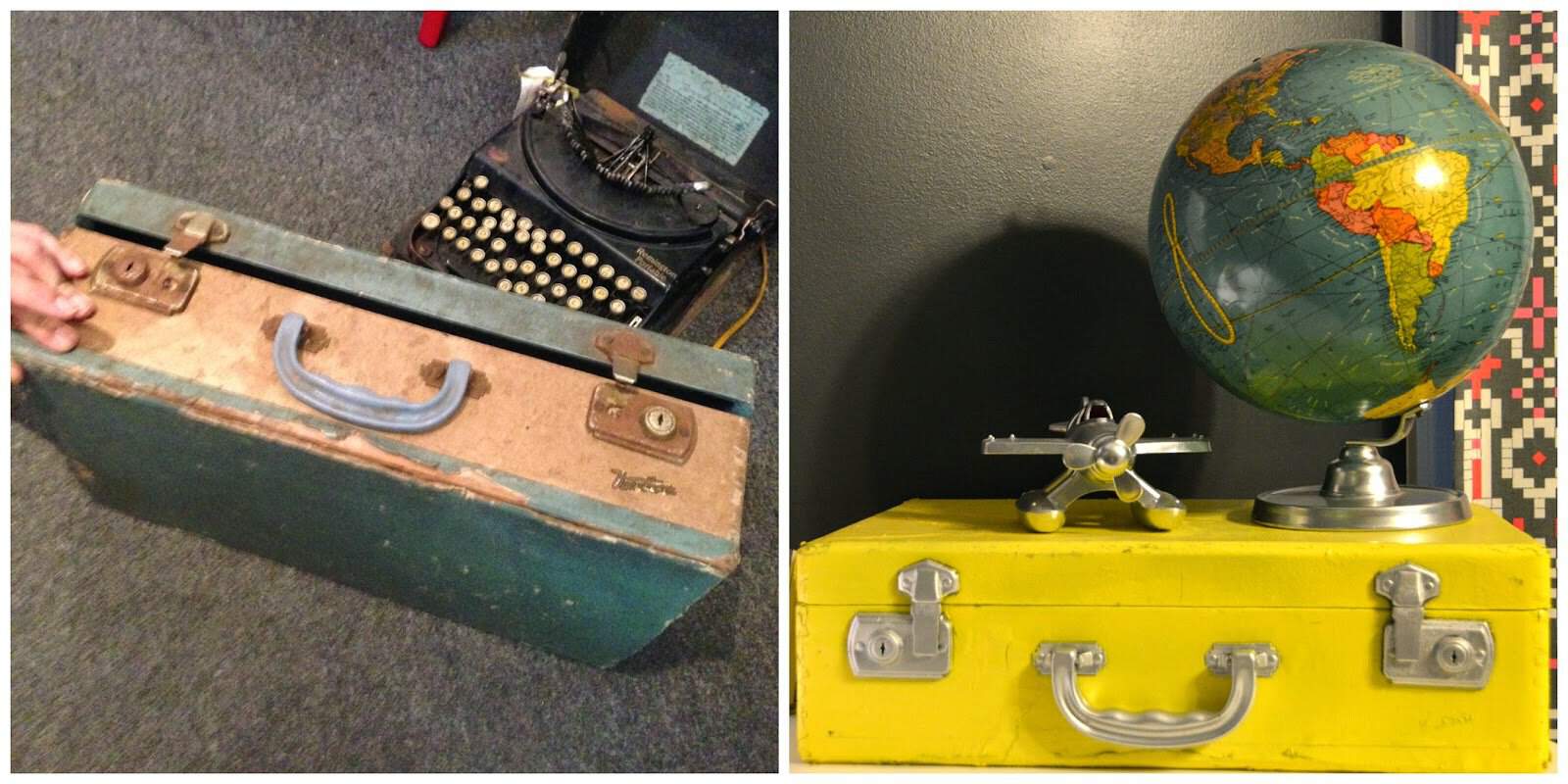
I really wanted the room to be authentic so I hunted for a vintage globe. Zach spray painted the base of it to give it that modern feel.
I found it on Etsy and it was probably the most costly thing in her room!
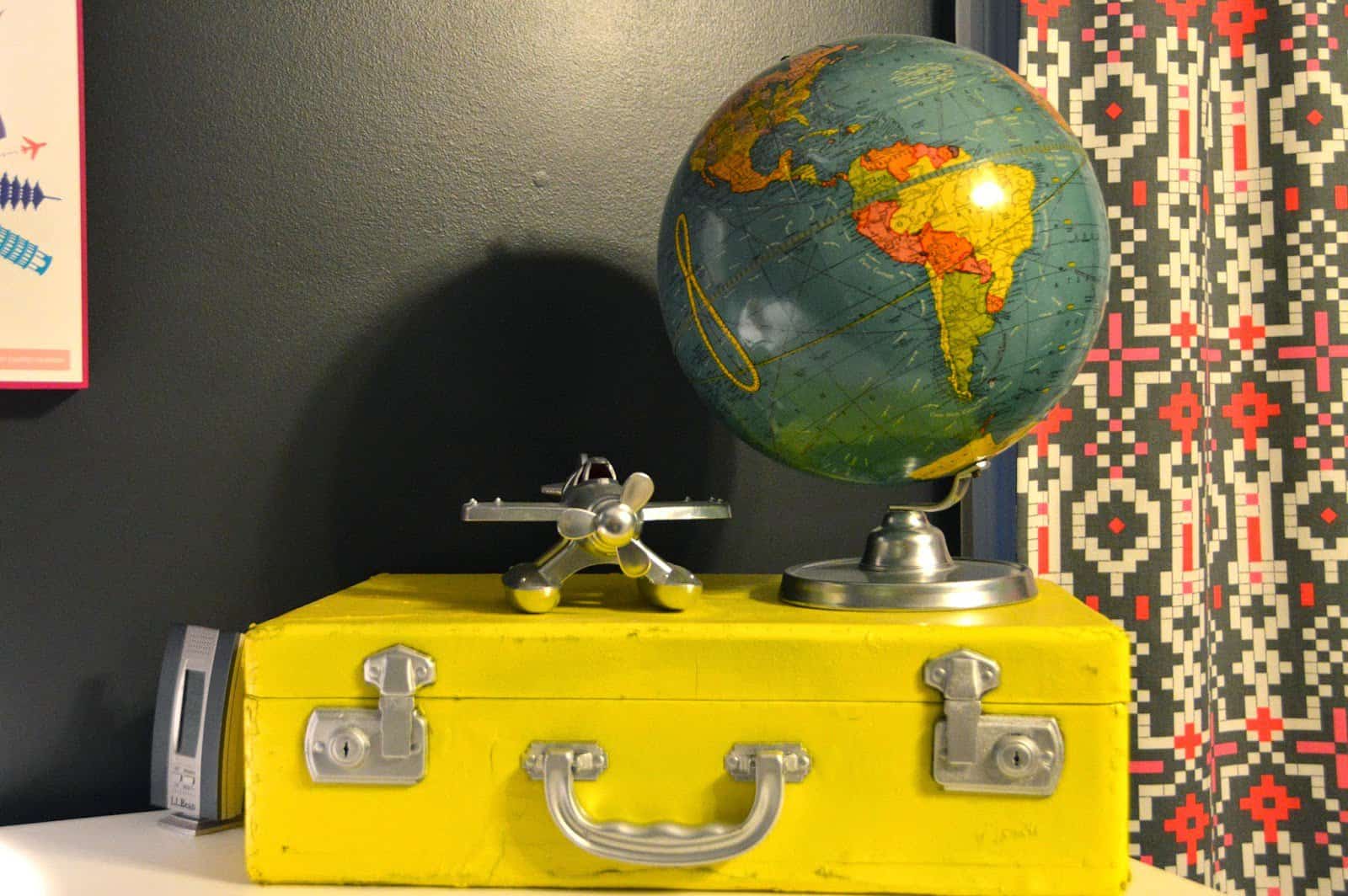
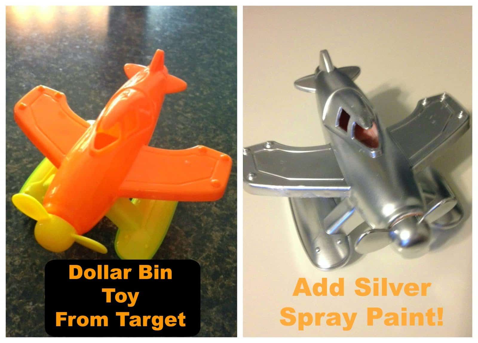
I found a plastic airplane in the dollar bin at Target (I’d imagine dollar stores would have them too?) then Zach just spray painted it silver. Doesn’t that make a huge difference? It looks so cool!
The lamp is also the same one from all three nurseries. I found a new shade and it worked well. One of the very first things I found on Pinterest that helped inspire me for this room was the wall plaque.
I knew I wanted one for our baby!!! It is SO cool! I ordered it right when she was born as the final touch for her room 🙂
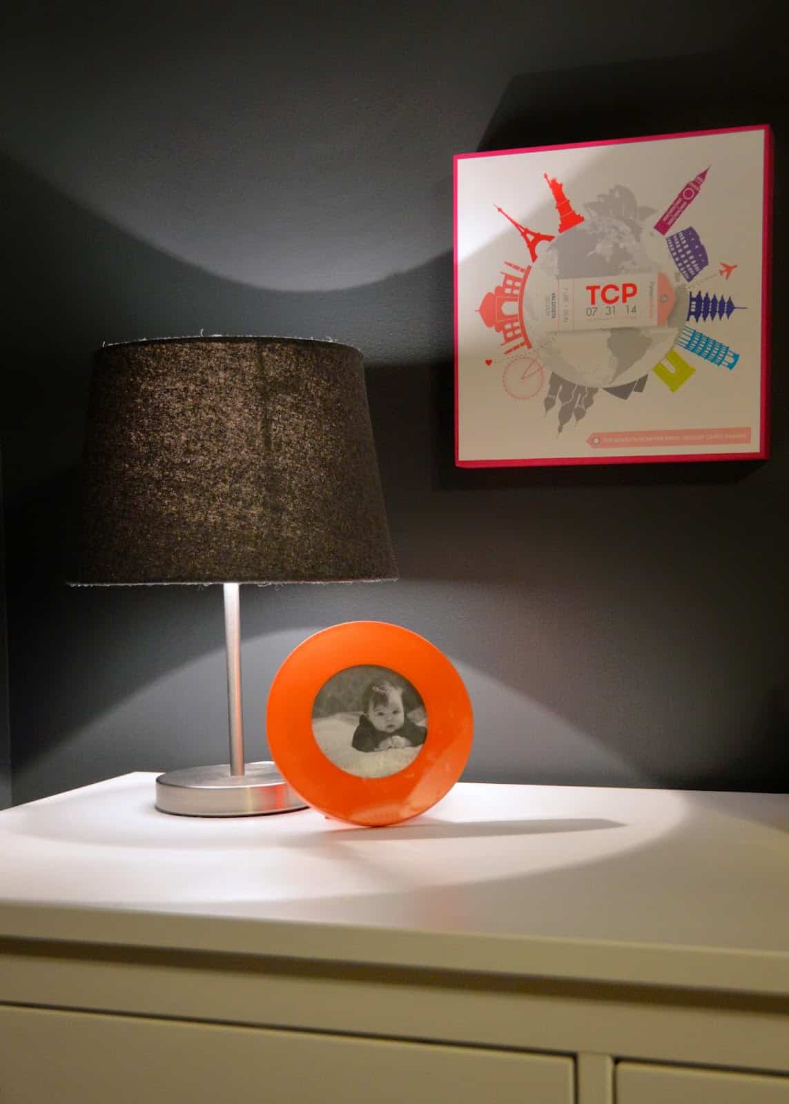
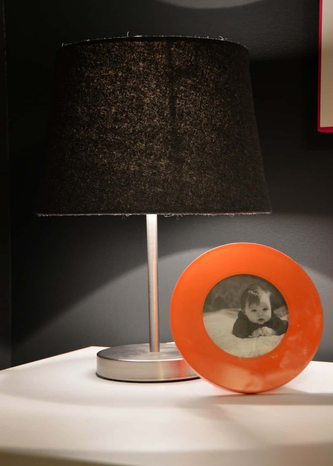
Little Ink Print designed and made the plaque for me! They have several awesome designs that would make a very special, personalized gift 🙂

This is the Proof of my order so you can read it a little better!

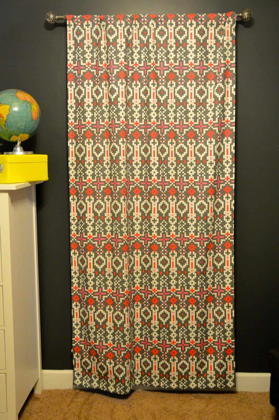
When I worked with Modified Tot I told her I wanted a black out curtain. It was a MUST for me. I’m big about keeping my baby’s rooms very dark to help them sleep 🙂
I hunted and hunted for patterns for the nursery. I had to pick patterns for both a girl nursery and a boy one. It was def the most stressful part of the nursery planning process.
It was all worth it though and I was pretty happy that Tess ended up being a girl b/c the fabric on the curtain was actually my FAVORITE of all the fabrics I chose!
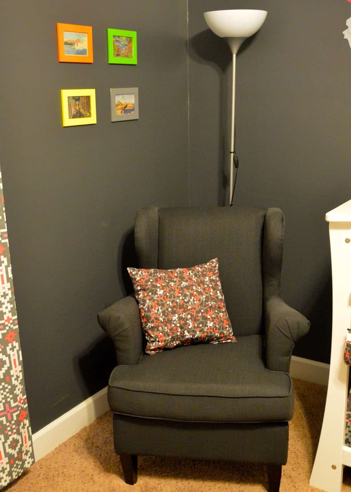
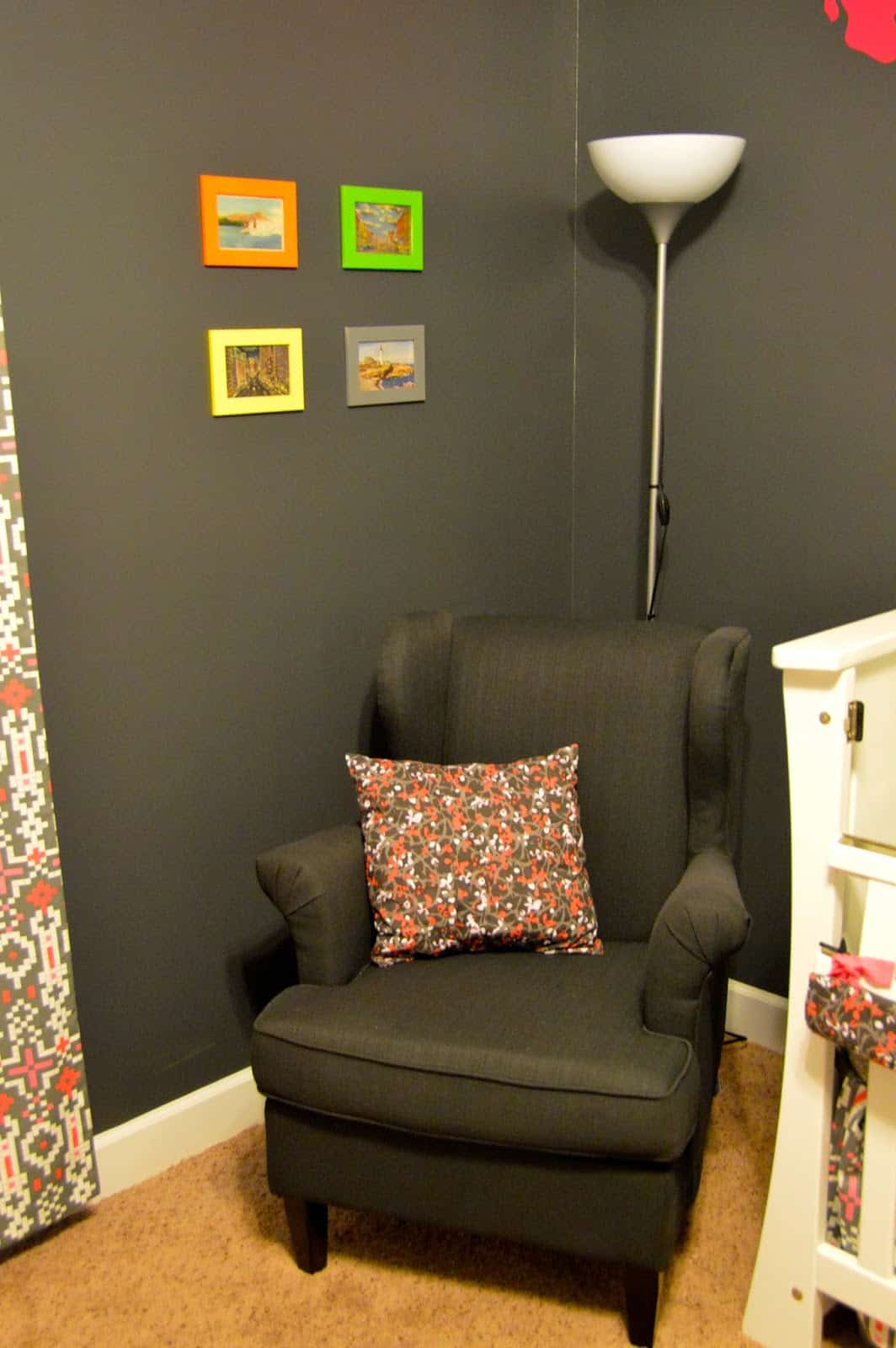
We’ve used this silver lamp in all of our nurseries as well. I saw a dark gray chair from Ikea and knew I wanted it but then I saw almost the same one at Target for a lot cheaper! It worked out great! The frames are all from Ikea and Zach painted them to match the luggage.
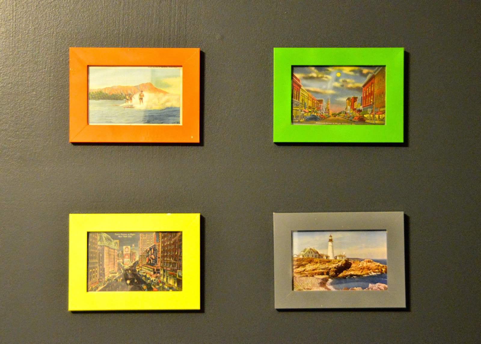
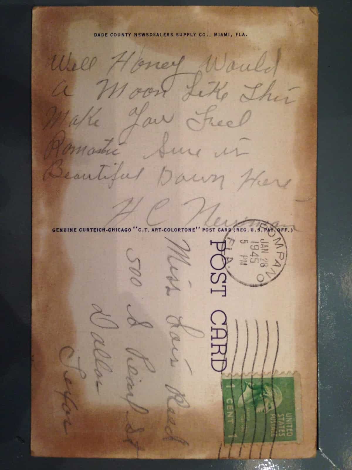
I had a lot of fun on Etsy finding vintage postcards of places we’ve visited. I wanted each one to be meaningful and each one to be authentically vintage. I know it’s probably silly b/c no one even looks at them (who spends time in the nursery?) but I know they are legit!
Top left is Diamond Head, Hawaii. Top right is one of my favorite finds: it’s downtown Valdosta! Bottom left is Times Square, NYC and bottom right is the Portland Headlight in Maine (another nod to my dad as he has many Portland Headlight items in his home! Zach and I did visit there together in my pre-blogging life!).
I loved reading the messages on the backs of the postcards!
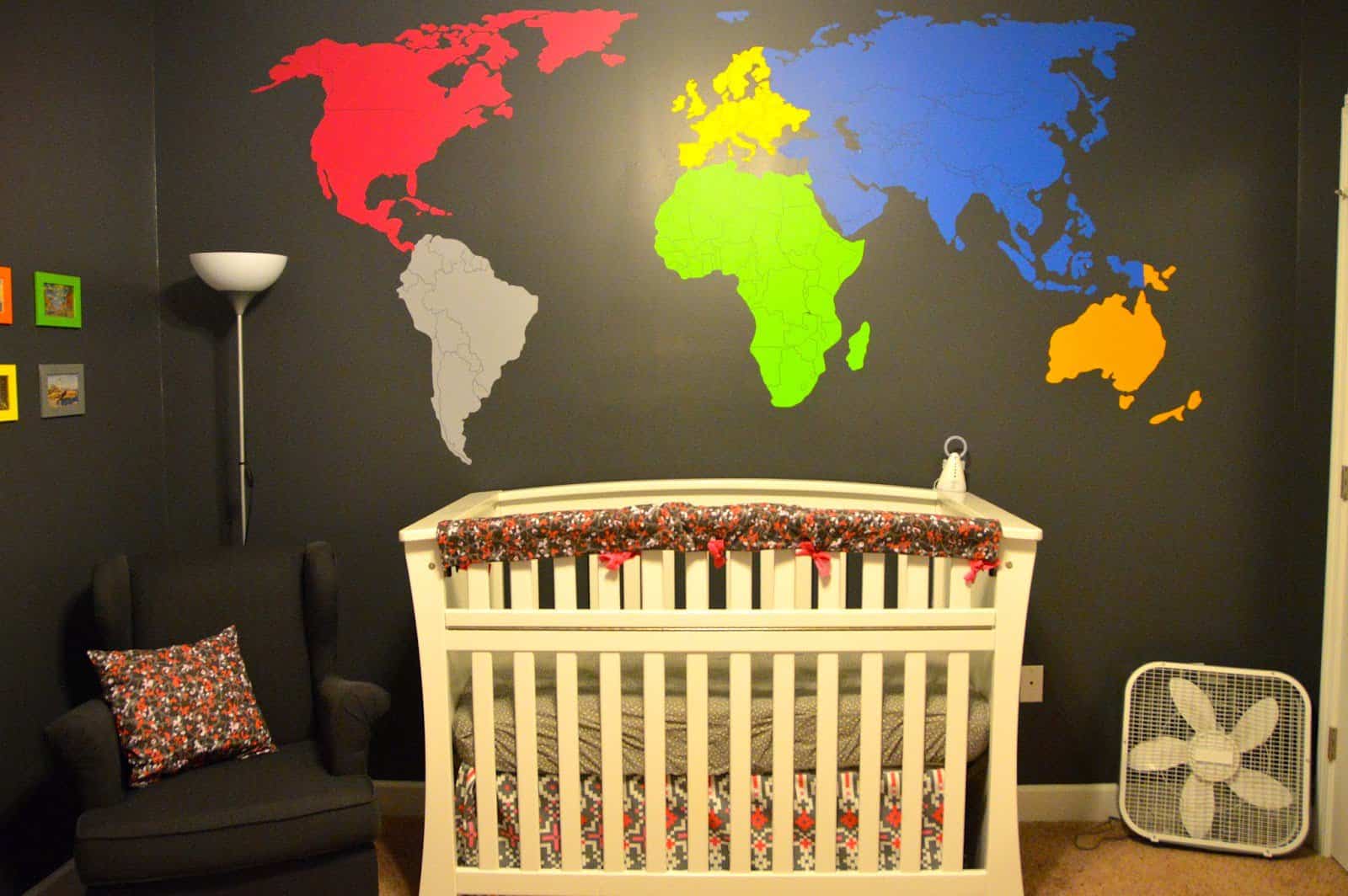
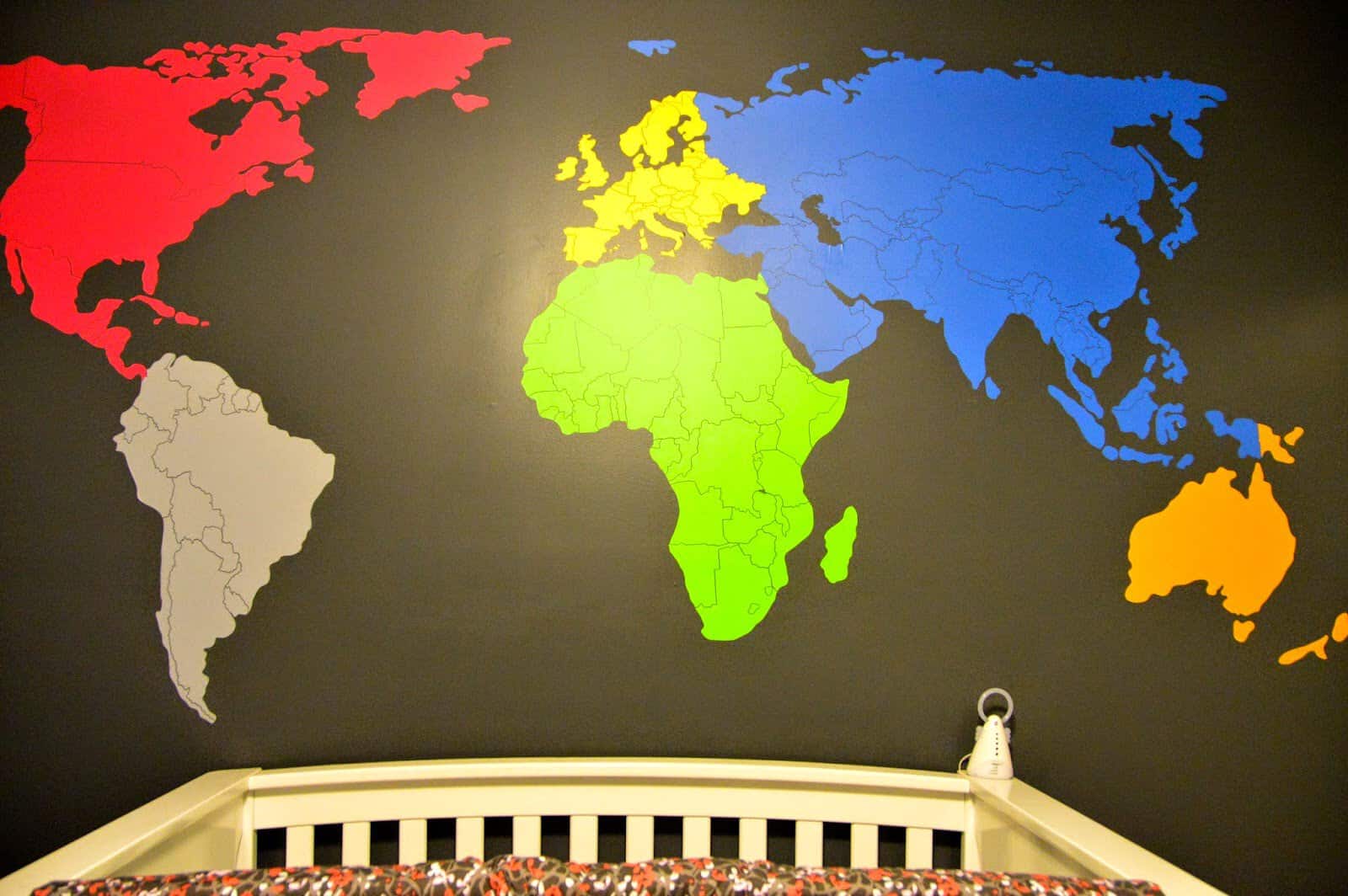
We decided early on that we also wanted a large decal of the world in her room. A wall-size decal is crazy expensive. I spent the most time on her nursery looking for fabrics and price comparing for map decals! I didn’t want any words or phrases and I wanted to be able to customize the color choices.
I ended up getting a great quality product as an affordable price from Zapoart! They were wonderful to work with! I have to give my husband mega props b/c this thing wasn’t easy to put up!
We didn’t do a mobile this time as I just wanted a very simple, clean look. Tess does stare at the map though…she’s going to know some world geography for sure 😉
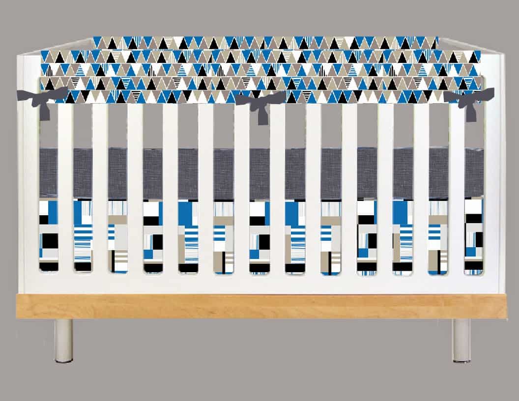
Here is the “final look” from the designer on her bedding. We do not use bumpers (why do companies even sell them anymore?!?!) so we did a cute crib rail instead! It all turned out exactly as I’d envisioned it!
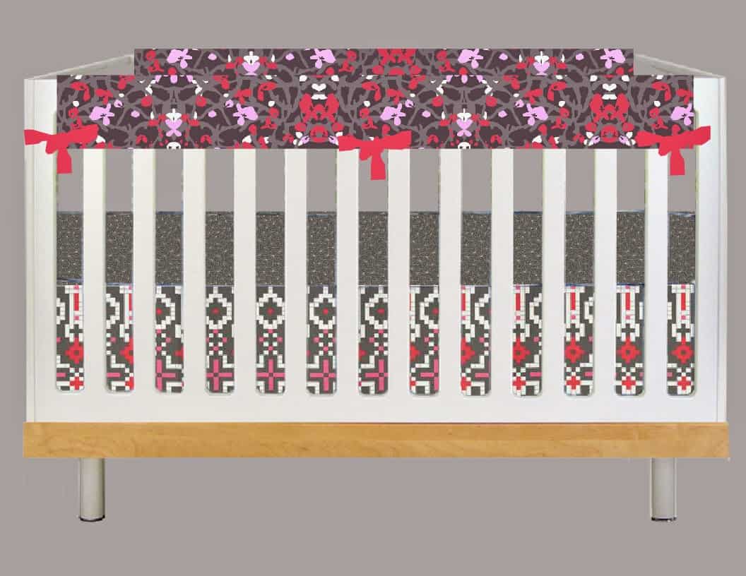
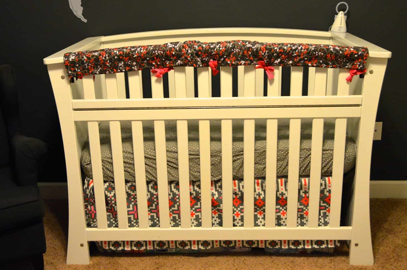
If Tess had been a boy then this would have been “his” look for “his” crib 🙂
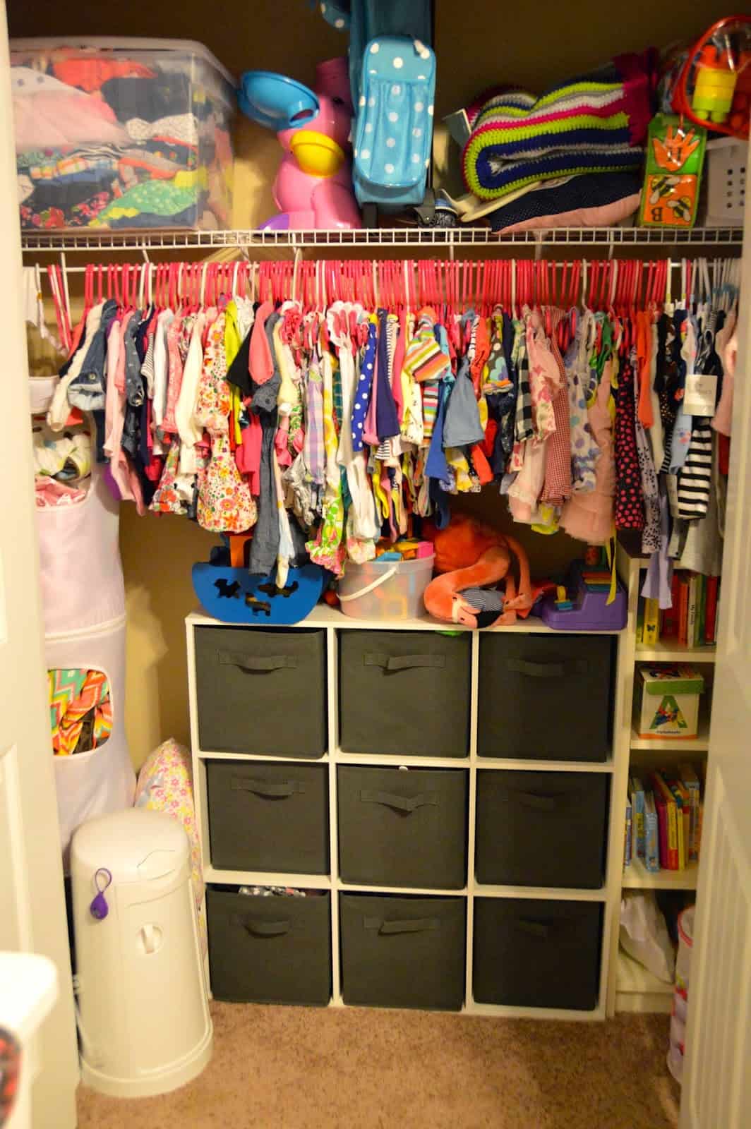
I love a good cube storage system! All my kids have one in their closets along with a book shelf. We used the same hanging thing in all three nurseries as well (Ikea) and use it to store their blankets.
Tess has SO MANY clothes. She already needs a bigger closet 😉 And these are only the ones that are her current size. Dressing a little girl is SO FUN!
For the changing table we used more of the postcards and pulled in the fabric from the curtains into the changing pad cover.
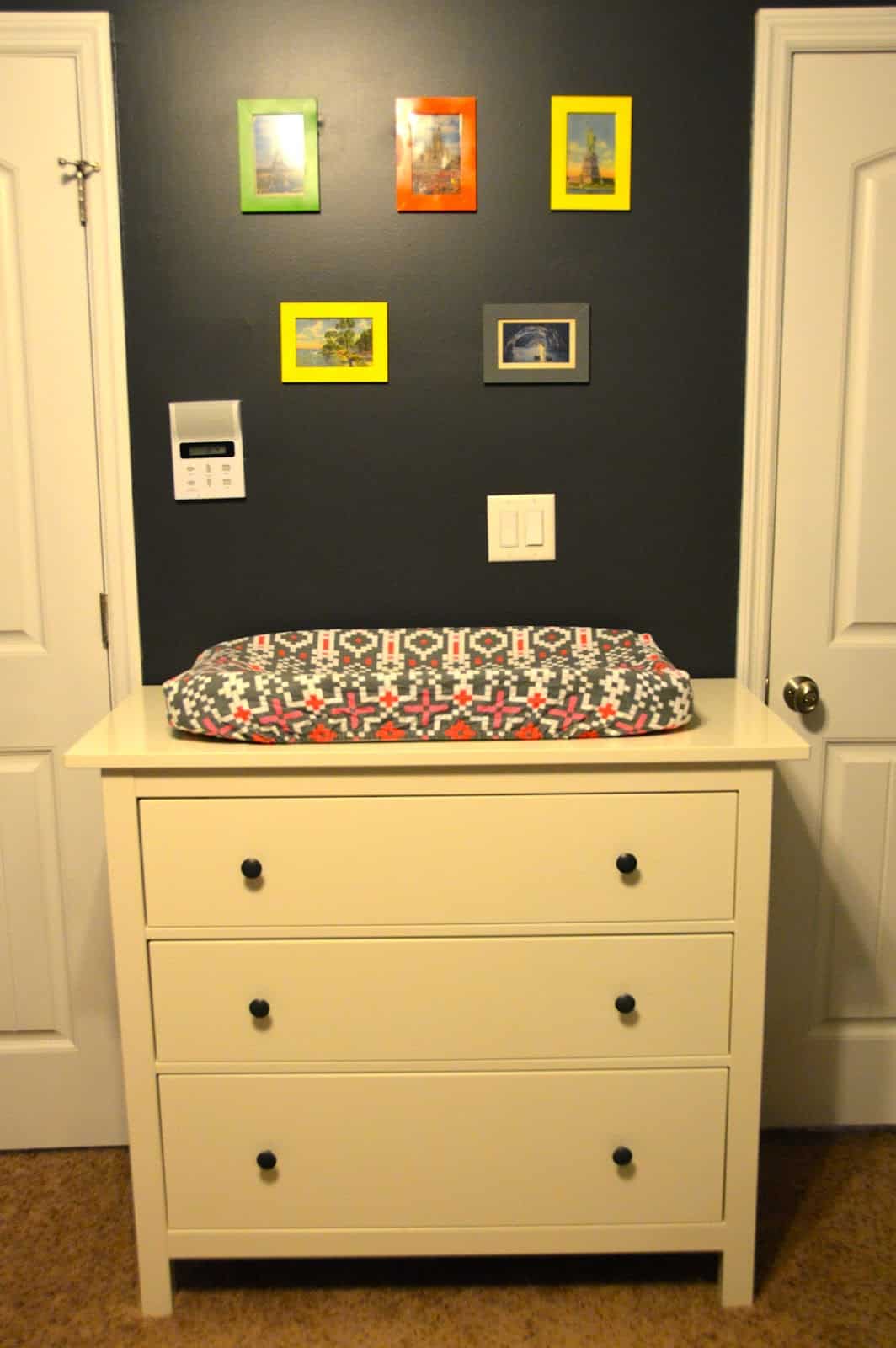
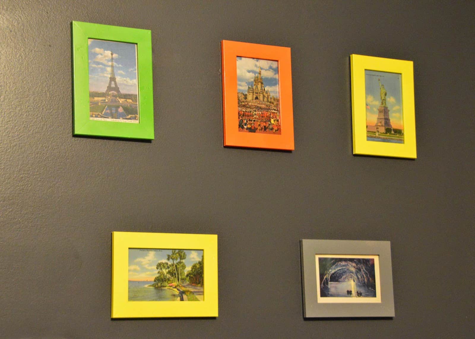
Top left is the Eiffel Tower in Paris, Top Middle is Cinderella’s Castle at Disney World (I LOVE this one b/c all the characters are in front of it and their old costumes are neat!), top right is Statue of Liberty in NYC. Bottom left is Indialantic, Florida (which is literally 5 minutes from the town where I was born) and bottom right is the Blue Grotto in Capri, Italy.
When we hung them we made sure to put the one from Capri where the baby would be able to see it! Tess’s middle name is Capri in honor of the place Zach and I loved so much!
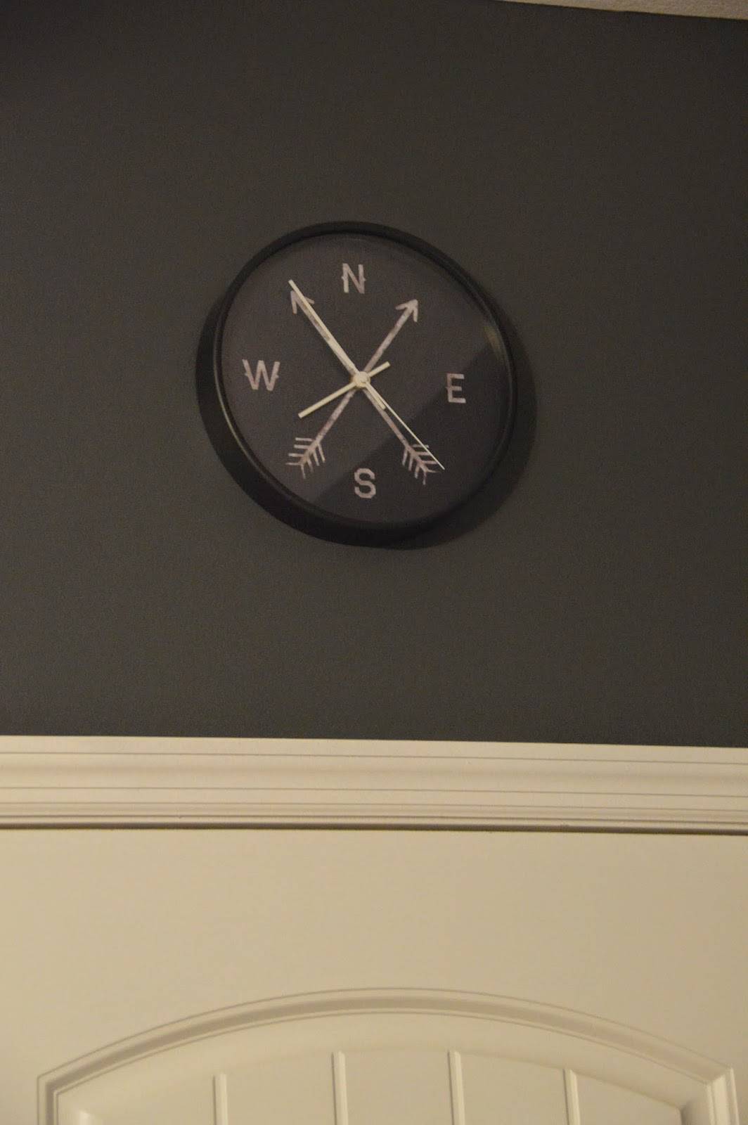
I also like to hang a clock above the entry door of all my kids’ rooms. It’s an easy spot to always glance at the time and when you’re a mama who schedules…the clock is pretty important 🙂
I found the clock from Society6. They had great costumer service as the first one we had didn’t work and they shipped us a replacement right away! Very impressed and I was excited to include a compass in our travel room 🙂
There you have it! With the way our house is set up our plan was always for the first 2 kids to have the upstairs bedrooms “forever” and the last 2 kids to have the downstairs rooms “forever.” I’m pretty sure once Kye moves out we will have Tess move up to his room (he’ll be 18 when she’s 13 so it’s good timing) so she can have a bigger closet and so she and Britt can share the nice bathroom up there.
We chose this nursery design for many reasons but one of them was thinking long term. She will be in this room until she’s at least 13, if not longer. We feel like this theme can stay the same for several years and the dark gray walls could easily transition into other themes as she grows up. I’m really happy with the entire room and hope she loves it and knows the love and care that went into making it special!
- A Letter to my Son on His 16th Birthday From Mom (Kye’s Bday Letter) - March 20, 2025
- Open Letter to my Daughter on her 12th Birthday – Love, Mom {Britt’s 12th Bday Letter} - January 16, 2025
- Letter to My Son on his 6th Birthday – Love Mom - January 8, 2025

